
Shopify Other Functions
Earn & Burn in Shopify
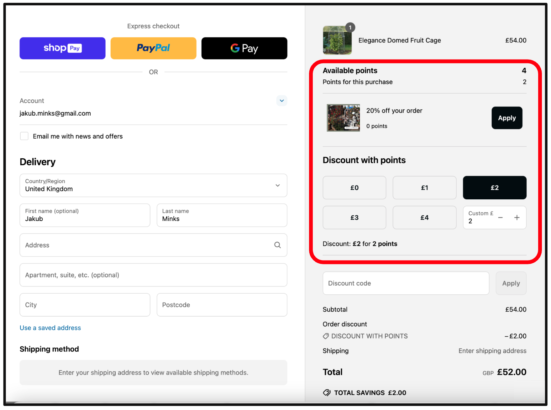
The Earn & Burn feature allows customers to exchange their accumulated loyalty points for a direct cash discount in Shopify. This integration is provided by TRIFFT and currently supports only the e-commerce checkout flow. The Shopify POS Earn & Burn implementation is on the development roadmap.
Summary
- Earn & Burn lets customers redeem loyalty points for cash discounts at checkout.
- Currently available only in Shopify e-commerce (not POS yet).
- Shopify Plus required for modifying the checkout page.
- Configurable limits ensure controlled redemption.
- Automatic deduction of points after checkout.
Enabling Earn & Burn
To enable the Earn & Burn feature:
- Go to TRIFFT Administration.
- Navigate to
Settings→Shopify. - Click on the
Settingstab. - Scroll down to
Earn & Burn. - Toggle on the
Enabledoption. - Click
Saveto apply the changes.
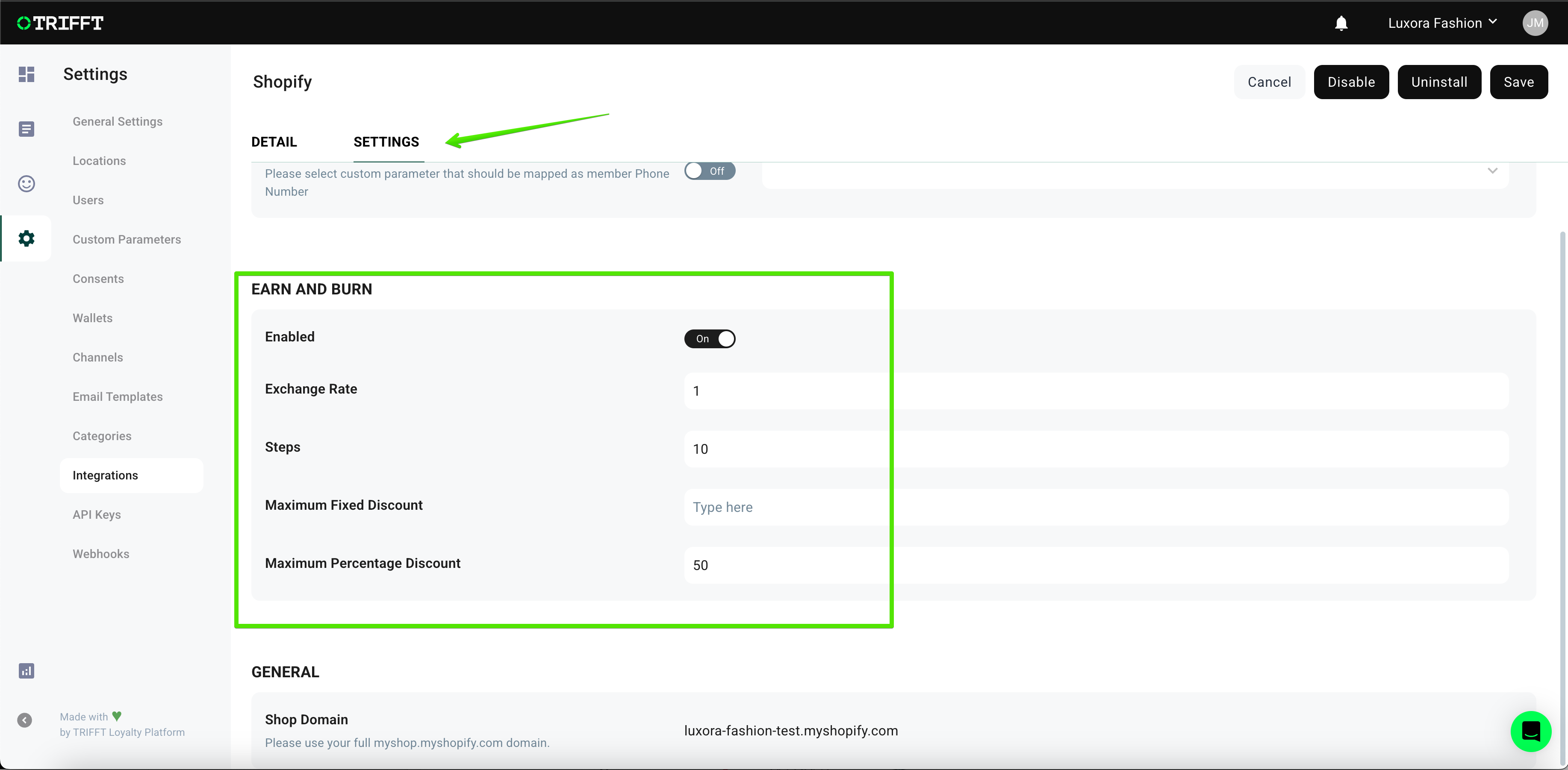
Configuring Earn & Burn Settings
Once enabled, you can configure the following settings:
- Exchange Rate – Defines how many points are needed to get one unit of local currency discount (e.g., if set to
5, then 5 points = 1 EUR/USD/GBP discount). - Steps – Defines the increment step in which points can be redeemed (e.g.,
1,10,100). - Maximum Fixed Discount – Sets the maximum amount that can be discounted in local currency (e.g., 30 EUR, 50 USD).
- Maximum Percentage Discount – Defines the maximum percentage of the order total that can be discounted.
How Rules Are Applied
If multiple constraints apply, TRIFFT automatically enforces the strictest limit:
- If a customer has
200points but can only apply a30 EURdiscount or a50%discount, the system calculates the maximum possible discount allowed and ensures member cannot apply higher discount.
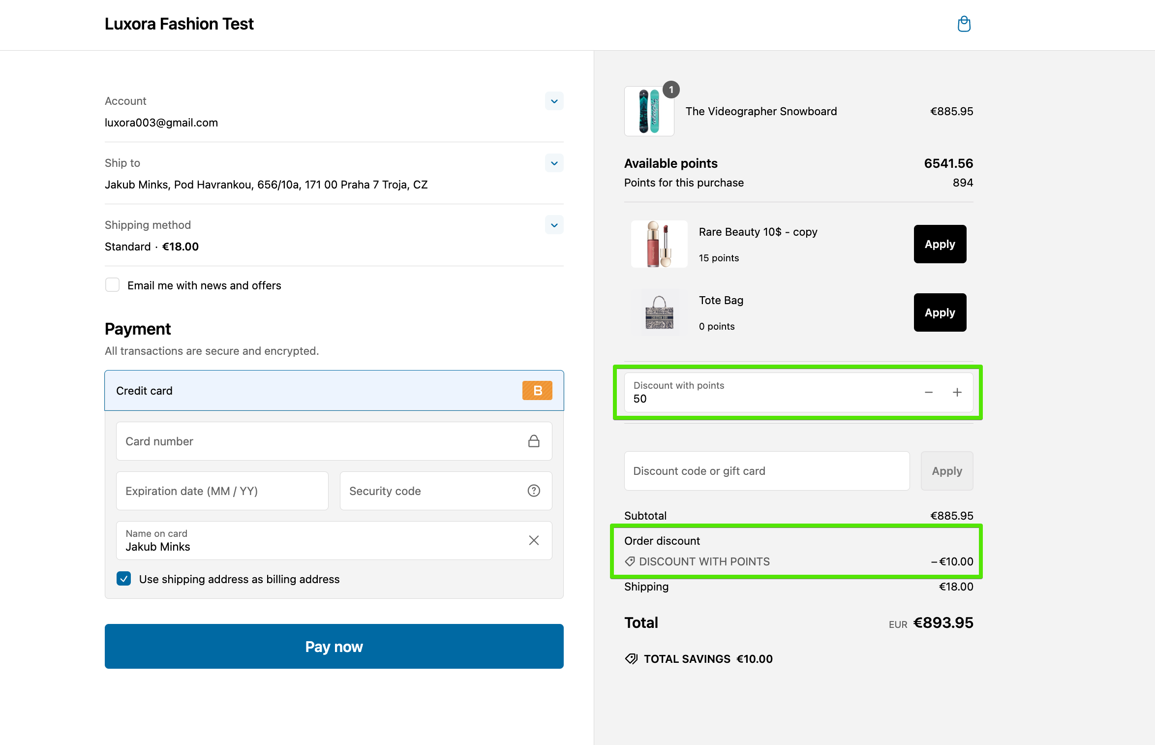
Using Earn & Burn in Checkout
Important: The Earn & Burn feature is only available for Shopify Plus users, as it modifies the checkout page.
How Members Redeem Points
- In the Shopify checkout page, the customer sees the available points balance.
- They increase or decrease the number of points used via the stepper (
+/-buttons). - The appropriate cash discount is automatically applied to the order.
- After checkout, the points are deducted from the member’s loyalty account.
Shopify POS extension
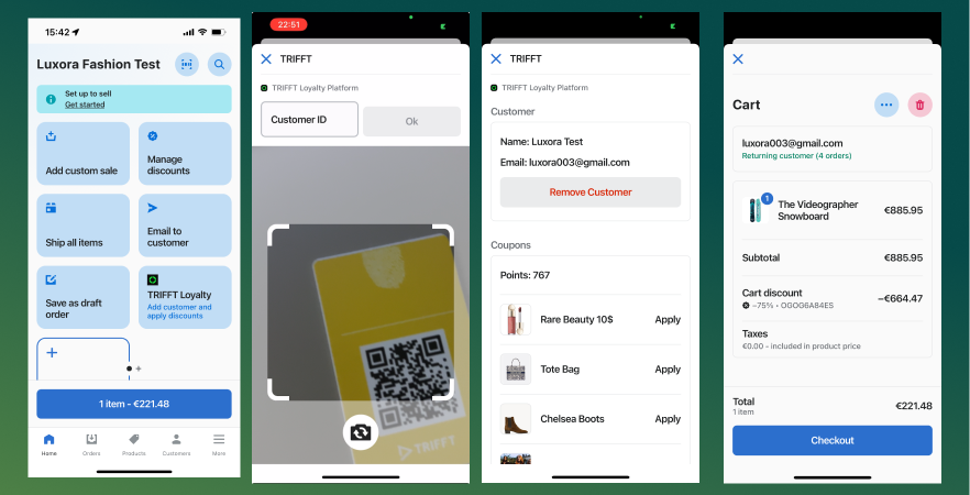
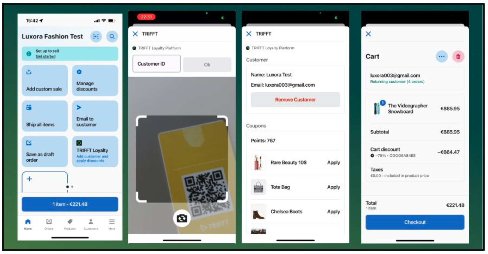
The TRIFFT POS UI Extension allows merchants to seamlessly manage loyalty points in-store, enabling customers to redeem rewards directly at checkout. This guide provides detailed instructions on how to use the extension, including customer identification and reward redemption.
Overview of features
Requirements for using TRIFFT Loyalty app for Shopify POS
- Have functional TRIFFT Loyalty Platform project.
- Have Shopify POS sales channel enabled and set up.
- Have "TRIFFT Loyalty Platform" app installed and configured on your Shopify project.
- Have TRIFFT Loyalty Platform app added to your Shopify POS grid. This can be achieved either viaShopify Admin or directly from Shopify POS.
Enabling the TRIFFT Loyalty Platform for POS from Shopify admin
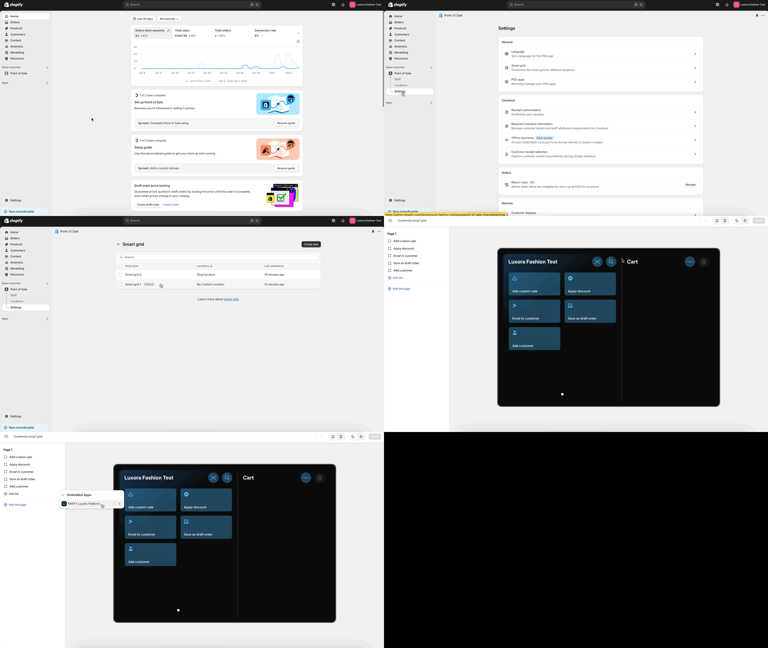
- Open your Shopify Admin Panel.
- Navigate to Sales Channels > Point of Sale > Settings
- Click on Smart grid (under General) > Select the desired Smart grid > Customize
- Navigate to Add tile > Embedded Apps > TRIFFT Loyalty Platform
- Click on TRIFFT POS and Apply
Enabling the TRIFFT Loyalty Platform for POS directly from Shopify POS mobile app
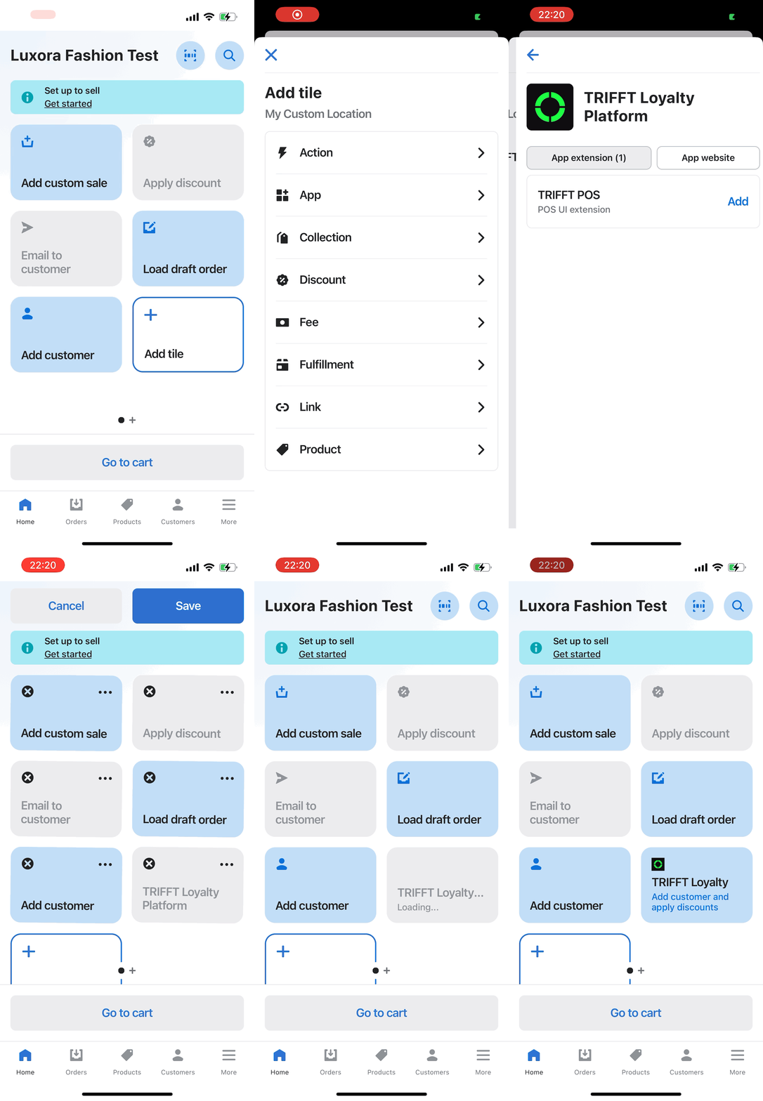
- Open your Shopify POS app on your device.
- Tap on Add tile (plus icon).
- Tap on App
- Select TRIFFT Loyalty Platform
- Tap on Add
Using TRIFFT loyalty module in POS
- Tap on TRIFFT Loyalty module
- Scan loyalty card with your POS camera, or use one of the alternative member lookup methods:
- Type in member card number and confirm with "OK"
- Type in member email address and confirm with "OK" (prerequisite)
- Type in member phone number and confirm with "OK" (prerequisite)
- If the member account exists in TRIFFT, you will see a screen with account overview, available point balance and list of Promotions that member can apply
- Tap Apply on promotions that member wishes to use with this purchase
- Continue with checkout process
Adding new members to TRIFFT loyalty program from Shopify POS
- In Shopify POS app, click on Customers
- Find the customer in your database (who's not yet a loyalty member) or add a new one by clicking a (+) icon at top-right corner
- Alternatively, create customer directly in Cart
- Upon checking out, a new member will be created in TRIFFT and transaction will be automatically assigned to that member
- if card issuing is set up in TRIFFT, member will automatically get a new loyalty card assigned
- Member can now be looked up by card, email, phone in TRIFFT Loyalty POS module
Using TRIFFT Variables in the "Custom Block"
TRIFFT variables let you personalize content in Shopify using data from the TRIFFT Loyalty Platform. They can be inserted into Custom block App block within Shopify.
Some variables are useful for displaying directly to customers (e.g.,%member.points%), while others are more suitable for debugging or internal QA (e.g.,%project.config.demo.enabled%).
How It Works
TRIFFT variables follow this structure:
%namespace.variable%
%namespace.variable.subvariable%
These variables will be automatically replaced with values based on the visitor’s loyalty data or your TRIFFT project configuration.
Examples:
Welcome to %project.name%!
You have %member.points% points.
Use your referral link: %member.referral.referral_url%
Do not use HTML or Liquid syntax in this block. Shopify Rich Text blocks only support plain text with inline variables.
Full Variable Reference
Project Variables
| Variable | Description | Sample Value |
|---|---|---|
%project.name% | Project name | Luxora Fashion |
%project.logo% | Logo image URL | https://cdn.trifft.io/files/66b2364eb4d87235677746.png |
%project.config.earn_and_burn.enabled% | Whether Earn & Burn is enabled | true |
%project.config.earn_and_burn.exchange_rate% | Exchange rate for points | 1 |
%project.config.earn_and_burn.max_fixed_discount% | Max fixed discount (in cents) | null |
%project.config.earn_and_burn.max_percentage_discount% | Max % discount allowed | 50 |
%project.config.earn_and_burn.step% | Redemption step size | 10 |
%project.config.demo.enabled% | Demo mode enabled? | false |
%project.config.demo.type% | Demo type | LOGGED_IN |
%project.config.referral.shopify_price_rule_id% | Shopify price rule ID used for referrals | null |

Member Variables
| Variable | Description | Sample Value |
|---|---|---|
%member.id% | Unique member ID | 8cabb75b-d05e-42e3-8c70-41c74b791b1a |
%member.points% | Current point balance | 59097 |
%member.referral.is_enabled% | Referral program status | false |
%member.referral.referral_code% | Member's referral code | H11TL1 |
%member.referral.referral_url% | Member's referral URL | https://3ft.us/ref/s/H11TL1 |
Member Tier Variables
| Variable | Description | Sample Value |
|---|---|---|
%member.tier.type% | Type of progression | POINTS |
%member.tier.amount% | Progression amount | 591 |
%member.tier.progress_start% | Tier start threshold | 0 |
%member.tier.progress_end% | Tier end threshold | 1000 |
%member.tier.progress_percent% | Progress % to next tier | 59 |
%member.tier.progress_remaining% | Remaining to next tier | 409 |
%member.tier.current_tier.name% | Current tier name | Bronze |
%member.tier.next_tier.name% | Next tier name | Silver |
Product Variable (only on product pages)
| Variable | Description | Sample Value |
|---|---|---|
%product.points% | Number of points earned for this product | 59 |
%product.points%only works when the block is placed on a product page. It retrieves the product's price, sends it to the backend, and returns the number of points that would be earned for that item. If used outside of a product page, it displays "%product.points%".
Styling & Layout in Shopify
Customize the TRIFFT App Block using built-in Shopify controls:
- Vertical and horizontal margin
- Section-specific custom CSS
Videos:
Shopify Widgets Overview
This guide provides a detailed overview of the TRIFFT loyalty widgets available for Shopify stores. Each component enhances the loyalty experience by integrating directly into the customer journey — from product pages to checkout and even in-store purchases.
1. Points Header
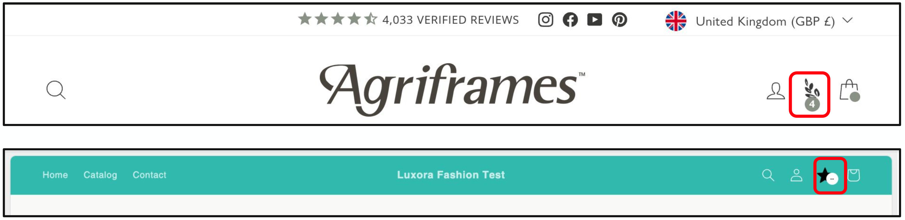
The Points Header is a small visual element that displays a customer’s current point balance directly in your store’s header. It can be styled to match your brand and linked to a loyalty landing page (e.g. /rewards).
What it is
A compact loyalty icon with a point counter, always visible at the top of the page. It informs the customer of their current loyalty status and serves as a quick-access gateway to the full program.
What to use it for
The header keeps your loyalty program top-of-mind and visible throughout the shopping experience. It reinforces the value of engaging with your program and encourages customers to check their balance regularly.
How it can be customized
- Icon image (e.g.,
star.png) - Icon background and foreground color
- Icon size (width and height)
- Target URL when clicked (e.g.,
/rewards)
2. Product Points Earned
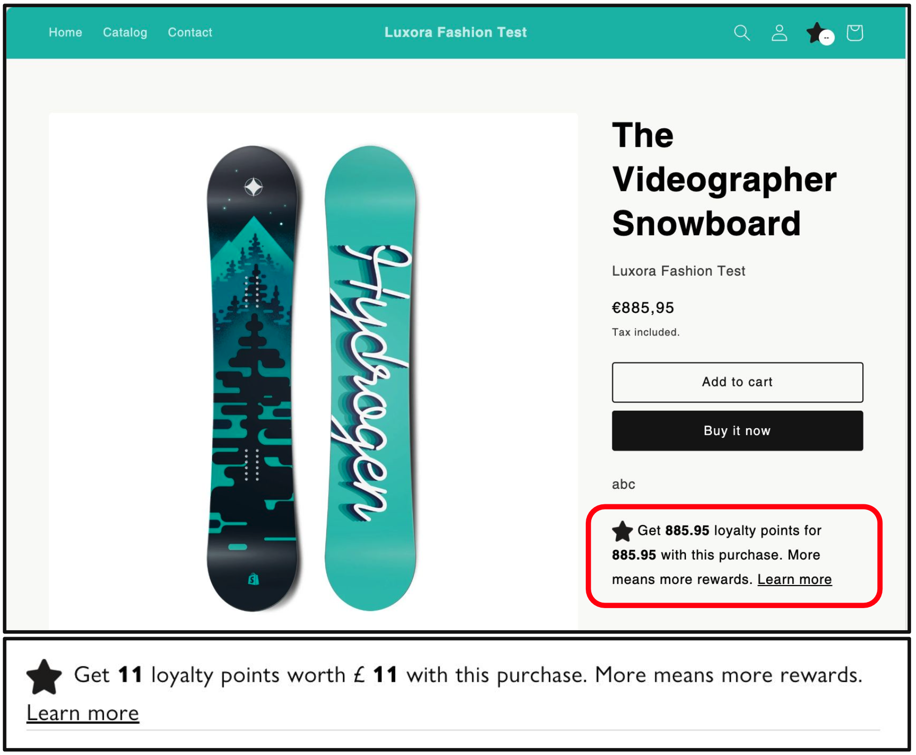
The Product Points Earned widget is a small visual cue on product detail pages that shows how many loyalty points a customer can earn from purchasing a specific item.
What it is
It uses loyalty logic (including tier-based conversion rates and rounding rules) to dynamically calculate and display potential rewards directly on the product page.
What to use it for
This feature highlights the value of each purchase by tying it directly to loyalty benefits. It can help drive conversions by showing the customer what they stand to gain beyond just the product itself.
How it can be customized
- Icon image and size
- Text and link colors
- Displayed text format (supports variables like
%points%and%amount%) - “Learn more” link (custom text and destination)
- Currency-to-points conversion logic (including per-tier settings)
- Points rounding behavior (up, down, nearest, none)
3. Engagement Tiles
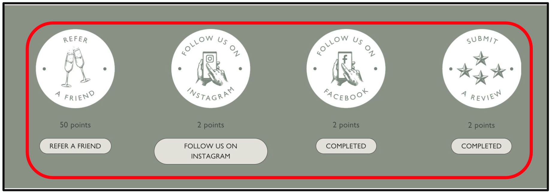
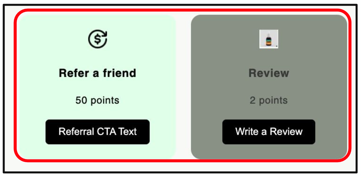
Engagement Tiles are interactive widgets that incentivize non-purchase behavior by rewarding customers for completing tasks.
What it is
These tiles appear on your loyalty program page and can include actions such as submitting a review, following your brand on social media, or referring a friend. Each tile is fully customizable and visually engaging.
What to use it for
Engagement tiles are ideal for driving increased brand interaction and participation beyond shopping. They’re especially useful for encouraging user-generated content, social follows, and referrals — all of which support organic growth.
How it can be customized
- Tile visibility settings (enable/disable specific tiles)
- Tile visuals: icon image, tile background color, size
- Title and label texts
- CTA button: text, style, size
- Popup content for reviews or external engagements (rich text support)
- Social referral cards, messages, and link settings
- Destination URLs for Facebook, Instagram, and others
- Reward values for each engagement type
- Delayed reward triggers for off-platform actions
4. Transaction History
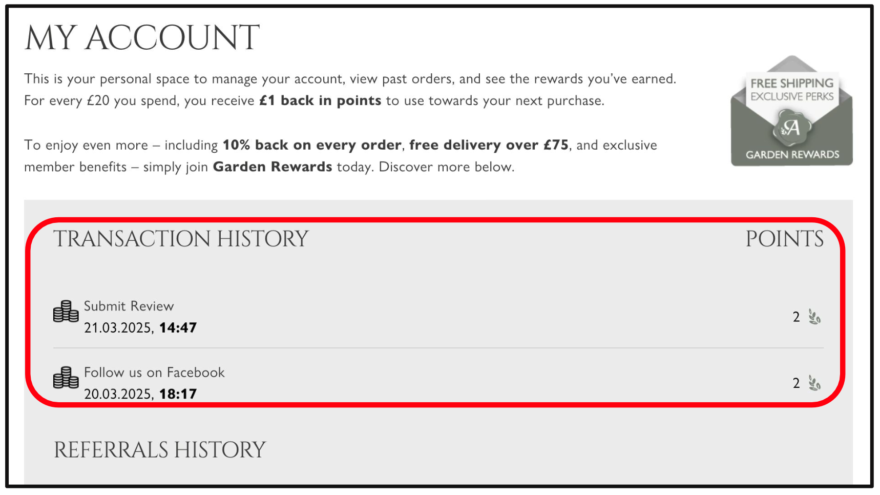
The Transaction History widget displays a complete log of a customer’s loyalty activity, including all points earned and redeemed.
What it is
A fully transparent history of how a customer interacts with the loyalty program. It shows every transaction involving loyalty points — from purchases and redemptions to expirations and engagement rewards.
What to use it for
This component builds trust by showing customers a full audit trail of their loyalty activity. It also reduces customer support needs by clearly answering “why do I have this many points?” questions.
How it can be customized
- Icon styles for points, purchases, redemptions, etc.
- Color themes and text formatting
- Button styles (colors, font size, padding, border radius)
5. Custom Block
Custom Blocks are flexible loyalty content sections that can be placed throughout your storefront and populated with personalized dynamic content from TRIFFT.
What it is
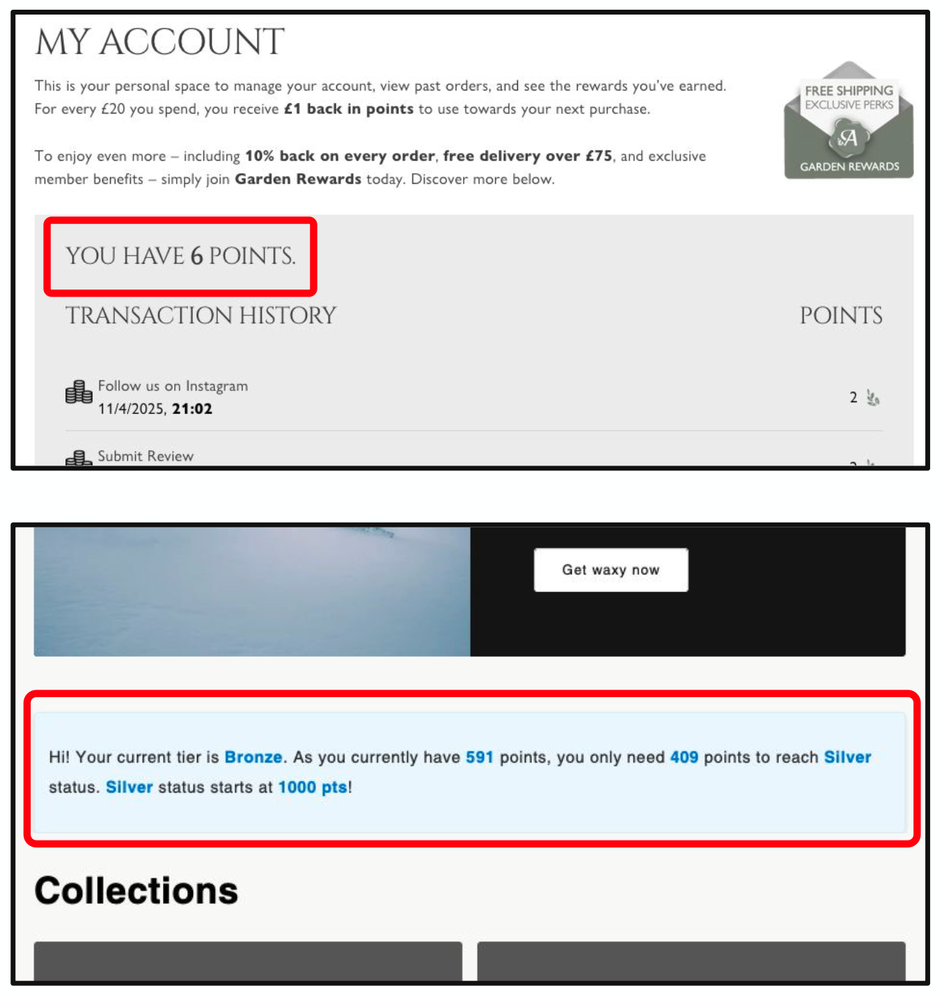
These blocks can include dynamic values such as a customer’s current point balance, tier name, or next tier threshold. They are highly adaptable and can be styled and placed in various parts of your online store.
What to use it for
To create unique, personalized loyalty experiences throughout your website. Whether you’re welcoming a returning user or highlighting a loyalty goal, Custom Blocks allow you to present real-time, meaningful data.
How it can be customized
- Dynamic variables (e.g.
%member.points%,%member.tier.next_tier.name%) - Layout and styling controls to match your store’s design
- Placement on pages such as home, account, product, or custom landing pages
6. Coupon List
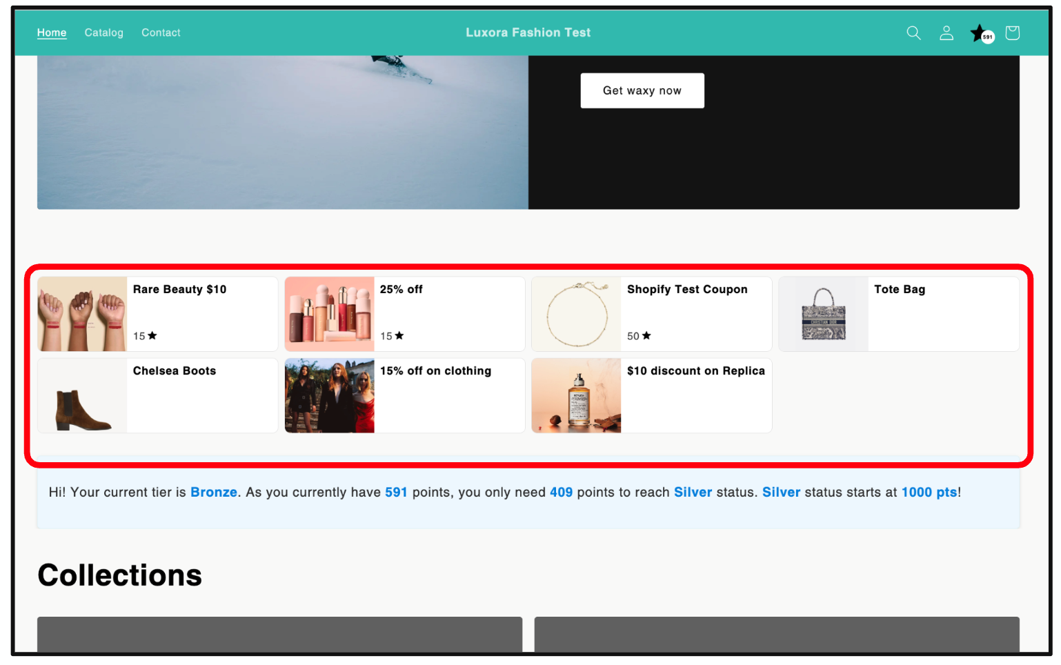
The Coupon List is a flexible widget that displays all loyalty coupons available to a specific member. It allows customers to view, browse, and redeem rewards directly from a storefront page — even if you're not using Shopify Plus.
What it is
A loyalty-powered storefront section where users can see their available rewards. The widget dynamically shows only the coupons that are relevant and available to the currently logged-in member, based on TRIFFT’s rules and segmentation logic.
What to use it for
This component is especially useful for merchants using Shopify Basic, as it brings loyalty redemption into the storefront experience. It functions as a visual rewards “dashboard” that encourages ongoing engagement and makes loyalty feel more tangible.
How it can be customized
- Coupon visuals, names, descriptions, expiry dates, value, and point cost (configured in TRIFFT Admin)
- Display logic (shows only coupons eligible for the current member)
- Points icon
7. Checkout Module
The Checkout Module enables loyalty reward redemption directly within the Shopify Plus checkout page, including point-based discounts and coupon application.
What it is
An embedded loyalty section that appears at checkout, giving users the ability to redeem points for discounts or apply loyalty-issued coupons.
What to use it for
It brings immediate reward value to customers at a crucial moment — purchase decision. This can significantly increase checkout conversion rates and foster stronger loyalty.
How it can be customized
Due to Shopify limitations, the appearance cannot be directly styled. However, the following settings are managed via the TRIFFT admin:
- Earn & Burn settings (conversion rate, step size, max discount)
- Coupon rules and eligibility per member
8. Referrals
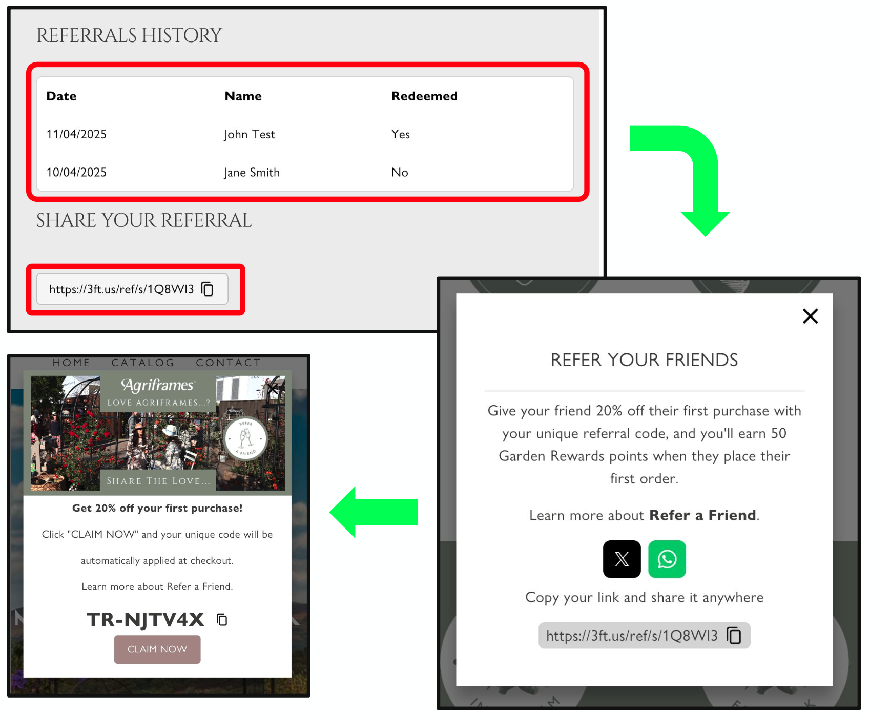
The Referrals system consists of three widgets that support user-to-user sharing and track engagement and reward status.
What it is
- Share Code Widget: Displays a user’s referral link for easy copy/share.
- Referral Claim Popup: Appears when a recipient clicks a referral link.
- Referral Activity Log: Shows the referring user a list of invites and statuses (e.g., redeemed or pending).
What to use it for
Drive organic customer acquisition through word-of-mouth by rewarding customers for referring friends and incentivizing new customers to join.
How it can be customized
- Custom messages, content for popups, and reward logic for both referrer and invitee
- Design elements (colors, layout, translations)
- Social sharing integrations (WhatsApp, Messenger, X, etc.)
9. ePOS Loyalty
ePOS Loyalty brings your online loyalty program into your physical retail locations using the Shopify POS system.
What it is
A loyalty panel embedded within the Shopify POS app that allows staff to look up customers by phone number, email, or loyalty ID and apply rewards or coupons.
What to use it for
Unify the loyalty experience across channels. Ensure your members are recognized and rewarded whether they shop online or in-store.
How it can be customized
- No visual customization
- Supports customer lookup via phone, email, or loyalty card ID
- Displays available points and applicable coupons
TRIFFT x Shopify Referral Integration Guide
Overview
This guide explains how to configure and manage Referral Programs within TRIFFT when integrated with Shopify. It covers the essential settings, reward logic, and Shopify-specific considerations required to launch a fully functioning referral workflow for your store.
1. Accessing Referral Settings
To begin configuring your referral program in TRIFFT:
- Navigate to the Settings menu in the TRIFFT platform.
- From the left-hand navigation, click on Loyalty Mechanics.
- Select Referral from the list of loyalty mechanics.
This section contains all the necessary configuration fields to launch and manage a referral program.
2. Core Settings: Rewards and Points
Several key fields govern the behavior of referrals in TRIFFT. Here’s a breakdown:
a. Reward Points
- Purpose: Determines the number of loyalty points awarded when a referral event is completed.
- Usage: Set the amount of points both the referrer (the person who sends the invite) and the referred user (the person who receives it) will receive.
- This is the base configuration and will apply unless overridden by more specific settings.
b. Referrer Reward Points
- Purpose: Allows you to override the general reward points specifically for the referrer.
- Usage: Enter the number of points the referrer will receive upon successful referral.
c. Coupon Reward
- Purpose: Determines the loyalty coupon awarded when a referral event is completed.
- Usage: Enable this if you want to incentivize both the referred user and the referring user with a discount or benefit instead of points.
d. Referrer Coupon Reward
- Purpose: Issues a coupon to the referrer upon successful completion.
- Note: Optional – used when you want to offer coupons in place of points.
Important: All reward fields are independent and can be layered based on your desired referral structure.
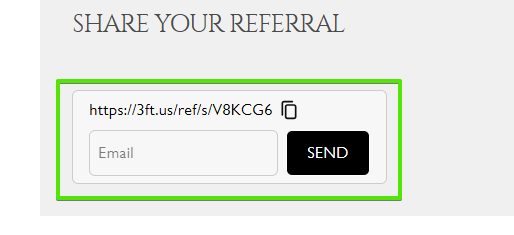
3. Optional Setting: Allow Invite by Email
- Field:
allow_invite_by_email - Function: Enables a user to refer others directly via email.
- How It Works: Unlocks an email input field in the TRIFFT Shopify widget, allowing users to send referral invites by entering an email address.
- When an email is entered, an invitation is automatically sent to the recipient's inbox with the referral link or code.
For more information on the functionality of Shopify Widgets, please visit this link.
4. Shopify-Specific Setup
To fully enable referrals in your Shopify store, a few additional steps are required:
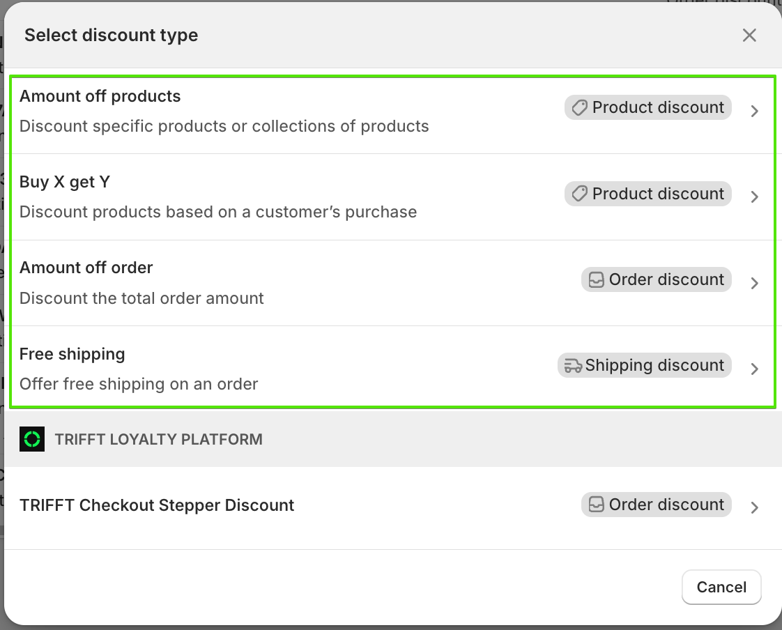
Step 1: Create a Discount in Shopify
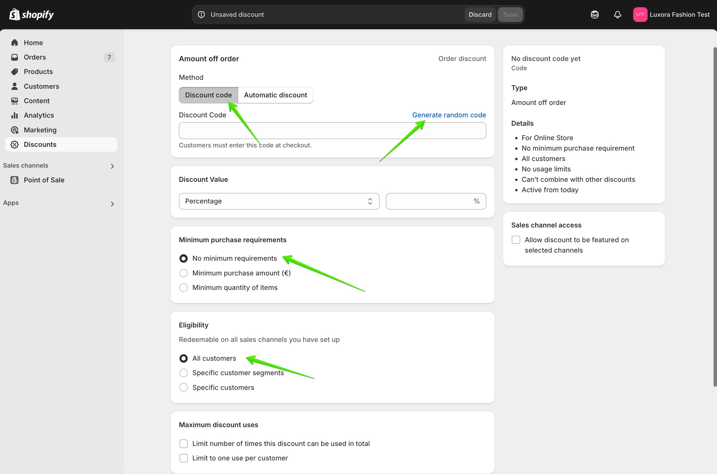
- In Shopify, go to the Discounts section and click Create Discount.
- Select the Discount Type
- Choose Discount Code and generate a random discount code.
- Configure the remaining discount settings according to your requirements.
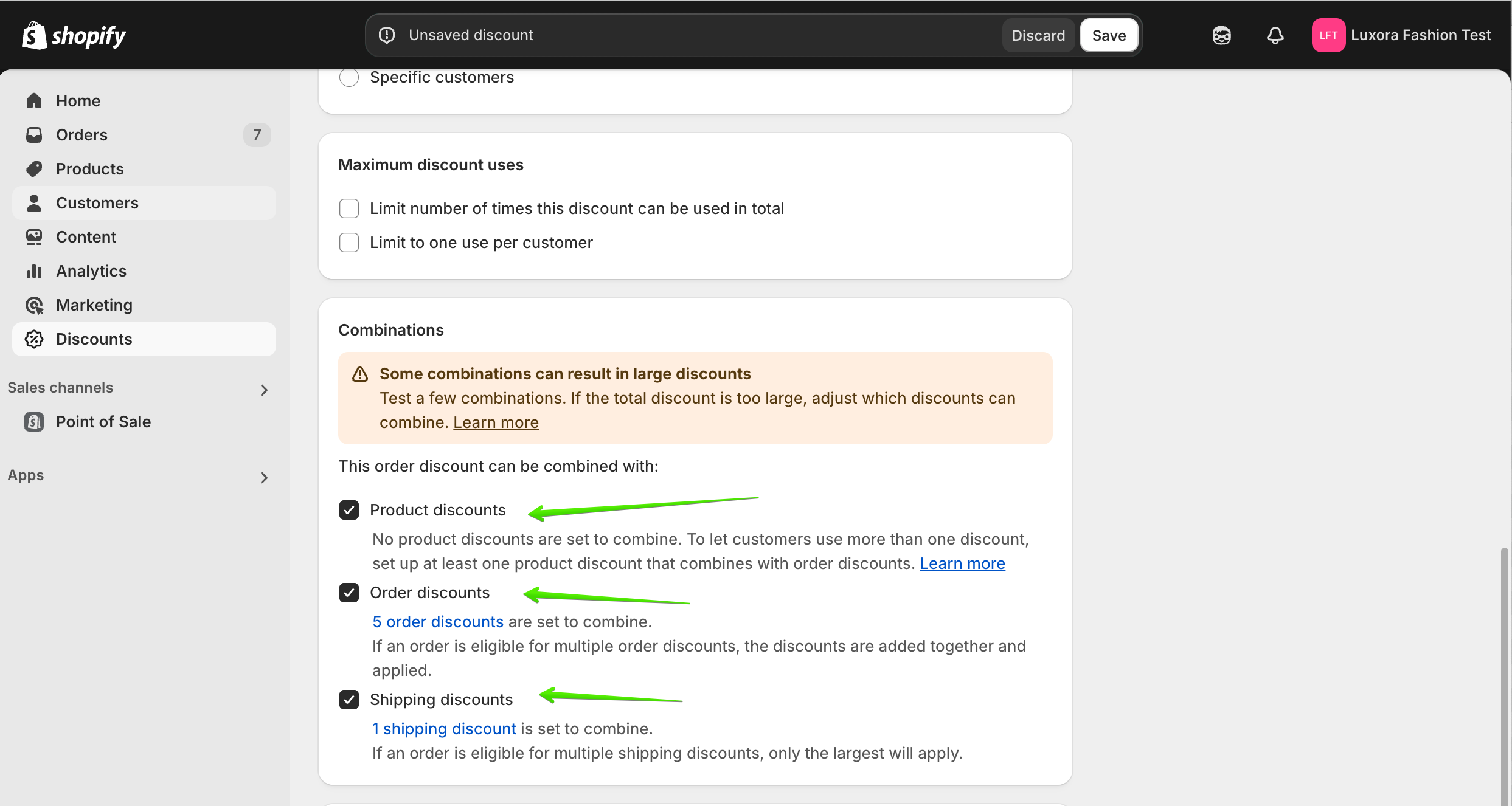
- The discount must be set up as follows:
- Ensure Combine with Order Discounts is enabled.
- This is required for the stepper to function correctly.
- Ensure Combine with Order Discounts is enabled.
- Click Save to finalize the discount.

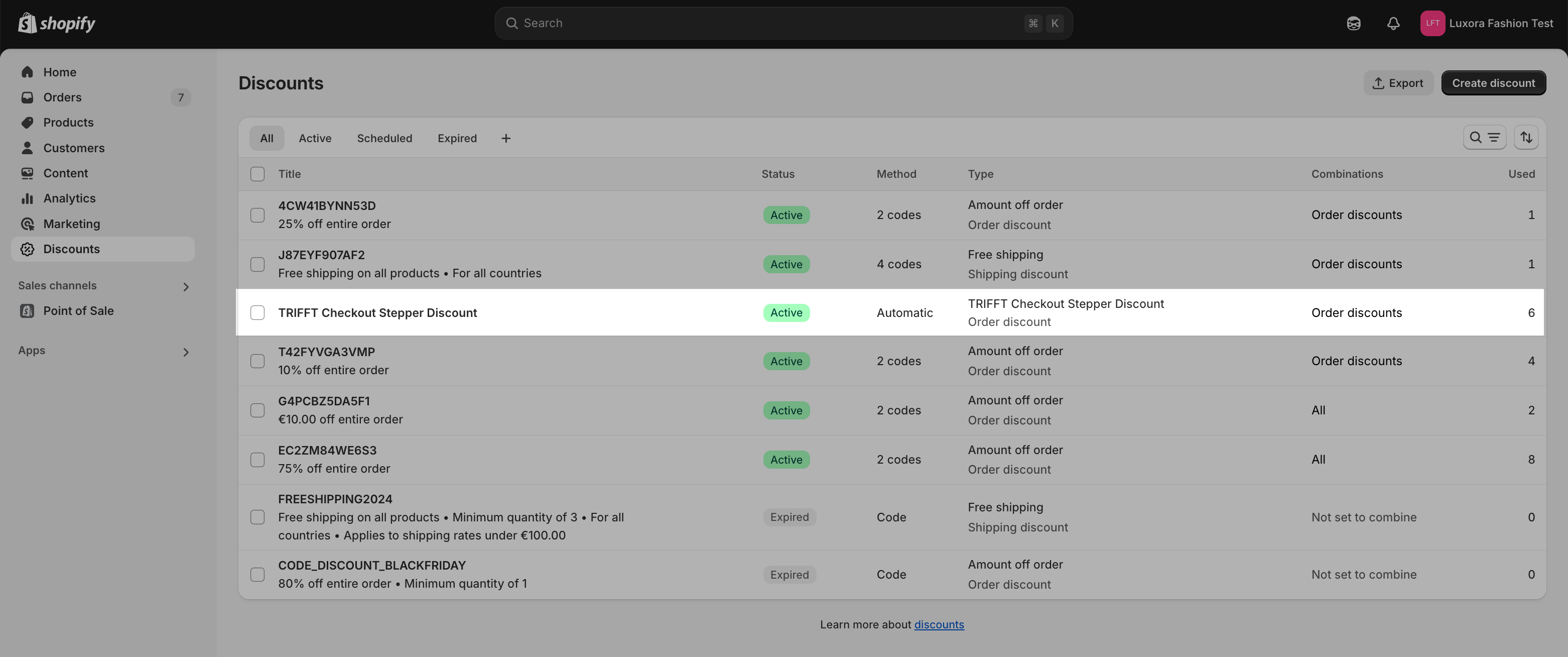
Important: Never delete the Checkout Stepper Discount Reward, or the stepper will not work. If the stepper discount stops functioning, turn the toggle off and on again to reset it.
Step 2: Link Shopify Discount to TRIFFT
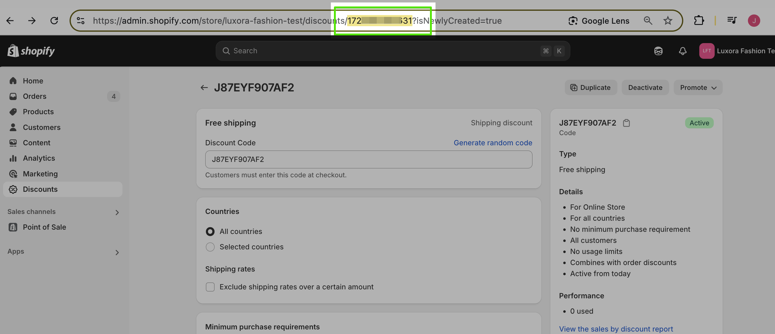
- Copy the Shopify Discount ID from the URL.
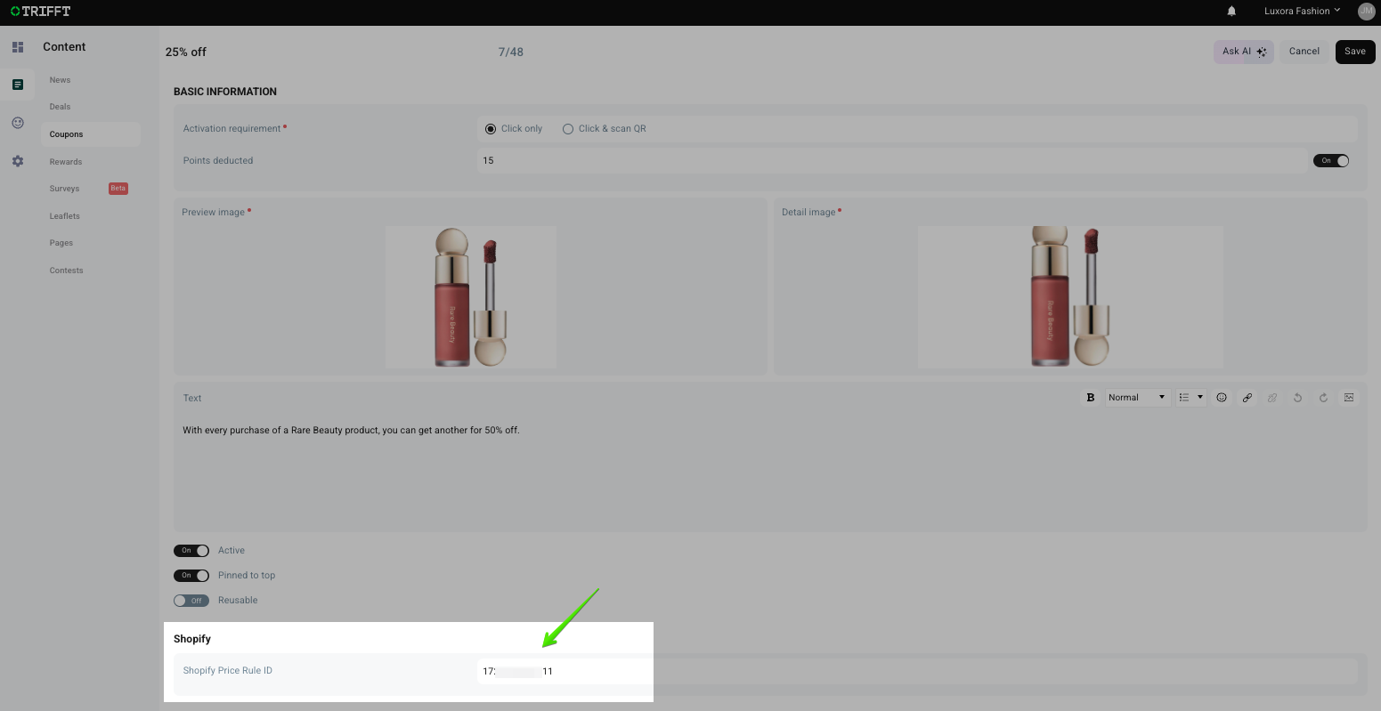
- Go to TRIFFT and locate the corresponding coupon.
- Paste the Shopify Discount ID into the Shopify Price Rule ID field.
- Save the changes.
5. Referral Pop-Up Customization
TRIFFT offers full flexibility in customizing the referral pop-up shown to users.
Customizable Fields:
- Pop-Up Title: The main heading of your referral widget.
- Pop-Up Text: Primary message or description.
- Bottom Text: Optional footer message.
All of the above fields support rich text formatting, so you can:
- Insert hyperlinks
- Use bold, italic, or colored text
- Adjust font size
Design Customization:
- Background Color
- Text Color
- Border Color
- Image Upload: Add a promotional image or brand asset to the referral pop-up.
6. Summary
| Feature | Purpose | Required? |
|---|---|---|
| Reward Points | Base reward logic for both referrer and referee | ✅ Yes (can be 0) |
| Referrer Reward Points | Override to customize referrer rewards | ❌ Optional |
| Coupon Reward | Issue a coupon to referred user | ❌ Optional |
| Referrer Coupon Reward | Issue a coupon to referrer | ❌ Optional |
| Allow Invite by Email | Email-based referral invitations | ❌ Optional |
| Shopify Discount Code | Links TRIFFT referrals with Shopify promos | ✅ Yes |
| Referral Pop-Up | Fully customizable UI | ✅ Recommended |
Best Practices
- Always test your referral flow in a Staging Environment before going live.
- Keep reward structures simple to avoid confusion for end users.
Manual Liquid Implementation
⚠️ Critical Note on Required Attributes:
Because you are implementing these tags manually, all attributes listed below are required. The web components do not possess internal fallback defaults. If you omit an attribute, the component may break or render incorrectly. We have provided the necessary Liquid Injection tags or Recommended Values for each property to help you build the HTML tags correctly.
Dynamic Text Variables (%%)
%%)Several components allow you to inject dynamic data (like the user's current points or the name of a coupon) directly into text attributes. These variables are always wrapped in percentage signs (e.g., %points%).
The components will automatically parse these strings and replace the variables with the correct live data for the logged-in user or the viewed product. The specific variables available depend on the component and the attribute being used.
Components
<trifft-header-user-points>
<trifft-header-user-points>This component serves as a persistent loyalty indicator, typically placed in the global header or navigation bar of your store. It displays the currently logged-in user's available points balance next to a customizable icon. Clicking it acts as a shortcut to the full loyalty account page. If the user is not logged in, it will hide itself or show a default unauthenticated state.
Example Usage
<trifft-header-user-points
  user-email="{{ customer.email }}"
  design-mode="{{ request.design_mode }}"
  image-url="{{ 'star.png' | asset_url }}"
  navigate-url="/trifft-account"
  url-target="inApp"
  circle-color="#ffffff"
  points-color="#000000"
  icon-width="25"
  icon-height="25"
></trifft-header-user-points>user-email(string): The email address of the currently logged-in Shopify customer. Liquid Injection:{{ customer.email }}design-mode(boolean): Whentrue, the component displays placeholder data. Liquid Injection:{{ request.design_mode }}image-url(string): The URL for the icon displayed next to the points. Liquid Injection:{{ "star.png" | asset_url }}navigate-url(string): The destination URL when a user clicks the component. Recommended Value:/trifft-accounturl-target(string): Defines how thenavigate-urlopens. Options:inApp,external. Recommended Value:inAppcircle-color(string): The CSS color for the background of the points indicator. Recommended Value:#ffffffpoints-color(string): The CSS color for the points text itself. Recommended Value:#000000icon-width(number): The CSS width for the user icon. Recommended Value:25icon-height(number): The CSS height for the user icon. Recommended Value:25
<trifft-referral-rewards>
<trifft-referral-rewards>This component visually showcases the available rewards a user can earn. It renders a grid or list of "Reward Cards" configured in the Trifft (e.g., "Refer a friend, get $10 off"). Clicking a referral reward triggers a popup to copy the referral link or share it directly to social media. Other rewards may include actions required to unlock them (e.g., "Follow on Instagram"). It belongs on a dedicated Rewards or Loyalty page.
Example Usage
<trifft-referral-rewards
  user-email="{{ customer.email }}"
  design-mode="{{ request.design_mode }}"
  image-size="30"
  button-bg-color="#000000"
  button-text-color="#FFFFFF"
  button-border-color="#000000"
  button-border-radius="6"
  button-border-width="1"
  button-padding-x="20"
  button-padding-y="10"
  button-font-size="16"
  button-text="SEND"
  input-border-radius="6"
  input-padding-x="8"
  input-padding-y="10"
></trifft-referral-rewards>user-email(string): The email address of the logged-in customer. Liquid Injection:{{ customer.email }}design-mode(boolean): Set totrueto visualize the rewards list with mock data. Liquid Injection:{{ request.design_mode }}image-size(number): The width and height (in pixels) for the reward icons. Recommended Value:30button-bg-color(string): The background color for the buttons. Recommended Value:#000000button-text-color(string): The text color for the buttons. Recommended Value:#FFFFFFbutton-border-color(string): The color of the button border. Recommended Value:#000000button-border-radius(number): The roundness of the button corners. Recommended Value:6button-border-width(number): The thickness of the button border. Recommended Value:1button-padding-x(number): Horizontal internal spacing for the buttons. Recommended Value:20button-padding-y(number): Vertical internal spacing for the buttons. Recommended Value:10button-font-size(number): The font size for the button text. Recommended Value:16button-text(string): The label displayed on the action buttons inside modals. Recommended Value:SENDinput-padding-x(number): Horizontal padding for input fields inside modals. Recommended Value:8input-padding-y(number): Vertical padding for input fields inside modals. Recommended Value:10input-border-radius(number): Corner radius for input fields inside modals. Recommended Value:6
<trifft-referrals-history>
<trifft-referrals-history>This component provides a clean, tabular log of a user's past referral activity. It allows the customer to see a list of friends they have referred, the date of the referral, and whether the friend has redeemed the invitation (meaning the user successfully earned their reward). Best placed on an account dashboard or dedicated referral page.
Example Usage
<trifft-referrals-history
  user-email="{{ customer.email }}"
  design-mode="{{ request.design_mode }}"
  head-bg="#f5f5f5"
  head-color="#000000"
  table-bg="#ffffff"
  table-color="#000000"
  table-border-radius="8"
></trifft-referrals-history>user-email(string): The email of the logged-in user. Liquid Injection:{{ customer.email }}design-mode(boolean): Iftrue, displays a sample table with dummy data. Liquid Injection:{{ request.design_mode }}head-bg(string): The background color for the table's header row. Recommended Value:#f5f5f5head-color(string): The text color for the table's header row. Recommended Value:#000000table-bg(string): The background color for the data rows. Recommended Value:#fffffftable-color(string): The text color for the data rows. Recommended Value:#000000table-border-radius(number): The corner radius for the table container. Recommended Value:8
<trifft-referrals>
<trifft-referrals>This is the primary action interface for the referral program. This component prominently displays the user's unique referral link inside a copyable box. Depending on your Trifft setup, it also renders input fields allowing the user to send referral emails directly from the widget.
Example Usage
<trifft-referrals
  user-email="{{ customer.email }}"
  design-mode="{{ request.design_mode }}"
  title="Share your referral"
  code-bg="#f7f7f7"
  code-color="#000000"
  code-padding-x="16"
  code-padding-y="8"
  code-border-radius="6"
  input-padding-x="8"
  input-padding-y="10"
  input-border-radius="6"
  button-bg-color="#000000"
  button-text-color="#FFFFFF"
  button-border-color="#FFFFFF"
  button-border-radius="6"
  button-border-width="1"
  button-padding-x="20"
  button-padding-y="10"
  button-font-size="16"
  button-text="SEND"
></trifft-referrals>user-email(string): The email of the logged-in user. Liquid Injection:{{ customer.email }}design-mode(boolean): Set totrueto show a sample referral code. Liquid Injection:{{ request.design_mode }}title(string): The heading text above the referral link. Recommended Value:Share your referralcode-bg(string): The background color of the referral code box. Recommended Value:#f7f7f7code-color(string): The text color of the referral code. Recommended Value:#000000code-padding-x(number): Horizontal padding inside the code box. Recommended Value:16code-padding-y(number): Vertical padding inside the code box. Recommended Value:8code-border-radius(number): Corner radius for the code box. Recommended Value:6input-padding-x(number): Horizontal padding for email input fields. Recommended Value:8input-padding-y(number): Vertical padding for email input fields. Recommended Value:10input-border-radius(number): Corner radius for email input fields. Recommended Value:6button-bg-color(string): Background color for the buttons. Recommended Value:#000000button-text-color(string): Text color for the buttons. Recommended Value:#FFFFFFbutton-border-color(string): Border color for the buttons. Recommended Value:#FFFFFFbutton-border-radius(number): Corner radius for the buttons. Recommended Value:6button-border-width(number): Border thickness for the buttons. Recommended Value:1button-padding-x(number): Horizontal padding for the buttons. Recommended Value:20button-padding-y(number): Vertical padding for the buttons. Recommended Value:10button-font-size(number): Font size for the button text. Recommended Value:16button-text(string): The label for the primary action button. Recommended Value:SEND
<trifft-custom-block>
<trifft-custom-block>A highly versatile component designed to inject custom HTML or rich text into the store while dynamically replacing variables with live loyalty data. This is perfect for custom hero banners ("Welcome back, you have 500 points!"), product-specific loyalty messages, or custom instructions.
Example Usage
<trifft-custom-block
  user-email="{{ customer.email }}"
  design-mode="{{ request.design_mode }}"
  hide-login-message="false"
  rich-text="You have %member.points% points, worth %custom_block.worth%."
  product-price="{{ product.selected_or_first_available_variant.price | default: product.price }}"
  product-sku="{{ product.selected_or_first_available_variant.sku | default: product.id }}"
  margin-x="0"
  margin-y="0"
></trifft-custom-block>user-email(string): The email of the logged-in user. Liquid Injection:{{ customer.email }}design-mode(boolean): Iftrue, renders the block for design purposes. Liquid Injection:{{ request.design_mode }}hide-login-message(boolean): Iftrue, the component remains hidden for guests. Recommended Value:falseproduct-price(number): Product price context. Liquid Injection:{{ product.selected_or_first_available_variant.price | default: product.price }}product-sku(string): Product SKU context. Liquid Injection:{{ product.selected_or_first_available_variant.sku | default: product.id }}margin-x(number): Horizontal margin outside the block. Recommended Value:0margin-y(number): Vertical margin outside the block. Recommended Value:0rich-text(string): The raw HTML or text content. Recommended Value:You have %member.points% points.
<trifft-overview>
<trifft-overview>This component acts as a high-level loyalty summary, usually placed at the top of a user's account page. It displays their current points and intelligently checks if any of their points are close to expiring. If points are expiring, it displays a clickable alert that opens a detailed modal explaining exactly when the points will vanish.
Example Usage
<trifft-overview
  user-email="{{ customer.email }}"
  design-mode="{{ request.design_mode }}"
  color="#000000"
  text="You have %points% points."
  alert-color="#ff0000"
  alert-text="%points_expiring% points expiring within 30 days"
  popup-title="Here's a breakdown of the points that will expire in the next 30 days."
></trifft-overview>user-email(string): The email of the logged-in user. Liquid Injection:{{ customer.email }}design-mode(boolean): Set totrueto preview with sample data. Liquid Injection:{{ request.design_mode }}color(string): The primary text color. Recommended Value:#000000alert-color(string): The text color for thealert-text. Recommended Value:#ff0000text(string): The primary message or status text. Recommended Value:You have %points% points.
Available Variables fortext:%points%: The user's total available points balance.%points_expiring%: The amount of points currently scheduled to expire soon.
alert-text(string): A secondary, highlighted message for expiring points. Recommended Value:%points_expiring% points expiring within 30 days
Available Variables foralert-text:%points%: The user's total points.%points_expiring%: The specific number of points expiring.
popup-title(string): The title for the detailed expiring points popup modal. Recommended Value:Here's a breakdown of the points that will expire in the next 30 days.
<trifft-user-coupons>
<trifft-user-coupons>This component lists all the coupons a user currently has access to. This includes coupons that are already active (which they can click to apply at checkout) and coupons they haven't claimed yet but have enough points to "purchase." Clicking an unredeemed coupon opens a confirmation popup to exchange their points for the discount code.
Example Usage
<trifft-user-coupons
  user-email="{{ customer.email }}"
  design-mode="{{ request.design_mode }}"
  hide-login-message="false"
  points-icon-url="{{ 'star.png' | asset_url }}"
  button-text="Claim Now"
  popup-title="Here's a %name%"
  popup-text-null-points="Click CLAIM NOW and your unique code will be automatically applied at checkout."
  popup-text-more-points="Click CLAIM NOW and your unique code will be automatically applied, and %points% points will be deducted at checkout."
  valid-from="Valid from: %date%"
  valid-until="Expires on: %date%"
  button-bg-color="#000000"
  button-text-color="#FFFFFF"
  button-border-color="#FFFFFF"
  button-border-radius="6"
  button-border-width="1"
  button-padding-x="20"
  button-padding-y="10"
  button-font-size="16"
></trifft-user-coupons>user-email(string): The email of the logged-in user. Liquid Injection:{{ customer.email }}design-mode(boolean): Set totrueto show sample coupons. Liquid Injection:{{ request.design_mode }}hide-login-message(boolean): Iftrue, hides the login message for guests. Recommended Value:falsepoints-icon-url(string): URL for the points icon displayed next to costs. Liquid Injection:{{ "star.png" | asset_url }}button-text(string): The label for the redemption button in the modal. Recommended Value:Claim Nowvalid-from(string): Localized label for the start date. Recommended Value:Valid from: %date%valid-until(string): Localized label for the expiration date. Recommended Value:Expires on: %date%button-bg-color(string): Background color for redemption buttons. Recommended Value:#000000button-text-color(string): Text color for redemption buttons. Recommended Value:#FFFFFFbutton-border-color(string): Border color for redemption buttons. Recommended Value:#FFFFFFbutton-border-radius(number): Corner radius for redemption buttons. Recommended Value:6button-border-width(number): Border thickness for redemption buttons. Recommended Value:1button-padding-x(number): Horizontal padding for redemption buttons. Recommended Value:20button-padding-y(number): Vertical padding for redemption buttons. Recommended Value:10button-font-size(number): Font size for redemption button text. Recommended Value:16popup-text-null-points(string): Message displayed when a coupon is free (costs 0 points). Recommended Value:Click "CLAIM NOW" and your unique code will be automatically applied at checkout.popup-title(string): The title of the redemption modal. Recommended Value:Here's a %name%
Available Variables forpopup-title:%name%: The name of the specific coupon (e.g., "$10 Off").
popup-text-more-points(string): Message displayed when a coupon costs points to redeem. Recommended Value:Click "CLAIM NOW" and your unique code will be automatically applied, and %points% points will be deducted at checkout.
Available Variables forpopup-text-more-points:%points%: The specific cost of the coupon in points.
<trifft-product-promotions>
<trifft-product-promotions>Designed strictly for Product pages (PDPs), this component detects if there are any special loyalty promotions or multipliers associated with the current product (e.g., "Double points on this item this week!"). If no promotions are active for the product, it renders nothing. If active, it displays an icon and promotional text to incentivize the purchase.
Example Usage
<trifft-product-promotions
  user-email="{{ customer.email }}"
  design-mode="{{ request.design_mode }}"
  color="#000000"
  icon-size="25"
  border-radius="0"
  link-color="#000000"
  link-text="Learn more"
  product-price="{{ product.selected_or_first_available_variant.price | default: product.price }}"
  product-sku="{{ product.selected_or_first_available_variant.sku | default: product.id }}"
></trifft-product-promotions>user-email(string): The email of the logged-in user. Liquid Injection:{{ customer.email }}design-mode(boolean): Set totrueto preview with sample data. Liquid Injection:{{ request.design_mode }}color(string): The primary text color. Recommended Value:#000000icon-size(number): The CSS size for the promotion icon. Recommended Value:25border-radius(number): The CSS border-radius for the icon container. Recommended Value:0link-color(string): The color for informational links. Recommended Value:#000000link-text(string): The text for the informational link. Recommended Value:Learn moreproduct-price(number): The price of the current product. Liquid Injection:{{ product.selected_or_first_available_variant.price | default: product.price }}product-sku(string): The SKU of the current product. Liquid Injection:{{ product.selected_or_first_available_variant.sku | default: product.id }}
<trifft-product-points-info>
<trifft-product-points-info>Another component built specifically for Product pages (PDPs). This widget analyzes the product's price and calculates exactly how many points the user will earn if they check out. It acts as an instant gratification tool, making the loyalty program a core part of the purchasing decision.
Example Usage
<trifft-product-points-info
  user-email="{{ customer.email }}"
  design-mode="{{ request.design_mode }}"
  image-url="{{ 'star.png' | asset_url }}"
  color="#000000"
  icon-width="25"
  icon-height="25"
  border-radius="0"
  text="Get %points% loyalty points for %amount% with this purchase. More means more rewards."
  link-color="#000000"
  link-url="[https://www.trifft.io/](https://www.trifft.io/)"
  link-text="Learn more"
  product-price="{{ product.selected_or_first_available_variant.price | default: product.price }}"
  product-sku="{{ product.selected_or_first_available_variant.sku | default: product.id }}"
></trifft-product-points-info>user-email(string): The email of the logged-in user. Liquid Injection:{{ customer.email }}design-mode(boolean): Set totrueto show a sample message. Liquid Injection:{{ request.design_mode }}image-url(string): URL for the icon displayed next to the text. Liquid Injection:{{ "star.png" | asset_url }}color(string): The primary text color. Recommended Value:#000000icon-width(number): The CSS width for the points icon. Recommended Value:25icon-height(number): The CSS height for the points icon. Recommended Value:25border-radius(number): The CSS border-radius for the icon. Recommended Value:0link-color(string): The color for the informational link. Recommended Value:#000000link-url(string): The destination URL for the link. Recommended Value:https://www.trifft.io/link-text(string): The text for the link. Recommended Value:Learn moreproduct-price(number): The price of the product. Liquid Injection:{{ product.selected_or_first_available_variant.price | default: product.price }}product-sku(string): The SKU of the product. Liquid Injection:{{ product.selected_or_first_available_variant.sku | default: product.id }}text(string): The message template. Recommended Value:Get %points% loyalty points for %amount% with this purchase. More means more rewards.
Available Variables fortext:%points%: The number of points the user will earn by purchasing this product.%amount%: The formatted price of the product.%worth%: The monetary value of the points earned (based on your earn/burn exchange rate).
<trifft-user-transactions-history>
<trifft-user-transactions-history>A highly detailed, scrollable ledger of every interaction the user has had with the loyalty program. It logs points earned (credits) via purchases or activities, points spent (debits) on coupons, and warns the user inline if a specific batch of points is approaching its expiration date. Clicking a row opens a modal with deeper transaction details.
Example Usage
<trifft-user-transactions-history
  user-email="{{ customer.email }}"
  design-mode="{{ request.design_mode }}"
  hide-login-message="false"
  credit-image-url="{{ 'coins.png' | asset_url }}"
  debit-image-url="{{ 'receipt.png' | asset_url }}"
  credit-transaction-image-url="{{ 'receipt.png' | asset_url }}"
  points-image-url="{{ 'star.png' | asset_url }}"
  background="#f5f5f5"
  border-color="#e5e5e5"
  border-radius="8"
  color="#000000"
  alert-text="%points% points expiring within %days% days."
  alert-color-standard="#E5E5E5"
  alert-color-warning="#ff0000"
  button-bg-color="#000000"
  button-text-color="#FFFFFF"
  button-border-color="#FFFFFF"
  button-border-radius="6"
  button-border-width="1"
  button-padding-x="20"
  button-padding-y="10"
  button-font-size="16"
></trifft-user-transactions-history>user-email(string): The email of the logged-in user. Liquid Injection:{{ customer.email }}design-mode(boolean): Set totrueto display sample transactions. Liquid Injection:{{ request.design_mode }}hide-login-message(boolean): Iftrue, hides the login message for guests. Recommended Value:falsecredit-image-url(string): URL for the icon representing points gained without a receipt. Liquid Injection:{{ "coins.png" | asset_url }}debit-image-url(string): URL for the icon representing points spent. Liquid Injection:{{ "receipt.png" | asset_url }}credit-transaction-image-url(string): URL for the icon representing points gained via a purchase. Liquid Injection:{{ "receipt.png" | asset_url }}points-image-url(string): URL for general points icon. Liquid Injection:{{ "star.png" | asset_url }}background(string): Background color for the transaction list container. Recommended Value:#f5f5f5border-color(string): Border color for the container. Recommended Value:#e5e5e5border-radius(number): Corner radius for the container. Recommended Value:8color(string): The primary text color. Recommended Value:#000000alert-color-standard(string): Text color for general informational expiration alerts. Recommended Value:#E5E5E5alert-color-warning(string): Text color for urgent expiration alerts (under 30 days). Recommended Value:#ff0000button-bg-color(string): Background color for the "Load More" button. Recommended Value:#000000button-text-color(string): Text color for the button. Recommended Value:#FFFFFFbutton-border-color(string): Border color for the button. Recommended Value:#FFFFFFbutton-border-radius(number): Corner radius for the button. Recommended Value:6button-border-width(number): Border thickness for the button. Recommended Value:1button-padding-x(number): Horizontal padding for the button. Recommended Value:20button-padding-y(number): Vertical padding for the button. Recommended Value:10button-font-size(number): Font size for button text. Recommended Value:16alert-text(string): The inline message displayed beneath a transaction if those points are expiring. Recommended Value:%points% points expiring within %days% days.
Available Variables foralert-text:%points%: The number of unredeemed points from this specific transaction that are expiring.%days%: The exact number of days remaining until the points expire.
<trifft-tier-progressbar>
<trifft-tier-progressbar>A graphical progress bar that shows how close a user is to reaching the next loyalty tier. It displays the user's current tier, their progress, and exactly how much they need to spend or earn to unlock the next level. This is best placed at the top of an account dashboard to immediately engage the user.
Example Usage
<trifft-tier-progressbar
  user-email="{{ customer.email }}"
  design-mode="{{ request.design_mode }}"
  override-progressbar-color="false"
  bar-color="#000000"
  bar-background="#e9ecef"
></trifft-tier-progressbar>user-email(string): The email of the logged-in user. Liquid Injection:{{ customer.email }}design-mode(boolean): Set totrueto show a sample progress state. Liquid Injection:{{ request.design_mode }}override-progressbar-color(boolean): By default, the bar inherits colors configured directly in the Trifft backend for that tier. If set totrue, it ignores the backend settings and forces thebar-colorandbar-backgrounddefined below. Recommended Value:falsebar-color(string): The CSS color for the filled portion of the progress bar (only active if override is true). Recommended Value:#000000bar-background(string): The CSS color for the unfilled background track of the bar (only active if override is true). Recommended Value:#e9ecef
Updated 6 days ago