
Mobile App Other Functions
This article describes advanced Mobile App configuration, the complete widget catalog shown in the Mobile App editor, link behavior, shared widgets, targeting, and optional channel settings.
Complete the baseline configuration in Mobile App Set Up before using these functions.
Widget Configuration Model
The Homepage, Profile, shared header and footer areas, and other configurable contexts use the same widget types. The exact fields displayed in the editor depend on the selected type.
Common Widget Settings
Most widgets include the following settings:
| Setting | Purpose |
|---|---|
| Internal title | Identifies the widget in the Content Cockpit. |
| Display title | Determines whether the title is displayed to customers. |
| Widget type | Selects the widget's content and behavior. |
| Visibility | Controls visibility by login state or hides the widget. |
| Segments | Restricts the widget to selected member segments. |
| Background | Uses the default, a transparent background, or a custom solid color where supported. |
| Title background | Controls the title-area background where supported. |
| Title color | Controls the customer-facing title color. |
| Title | Customer-facing widget title. |
Type-specific settings can include descriptions, media, buttons, links, height, corners, margins, colors, selected wallets, selected content, and layout controls.
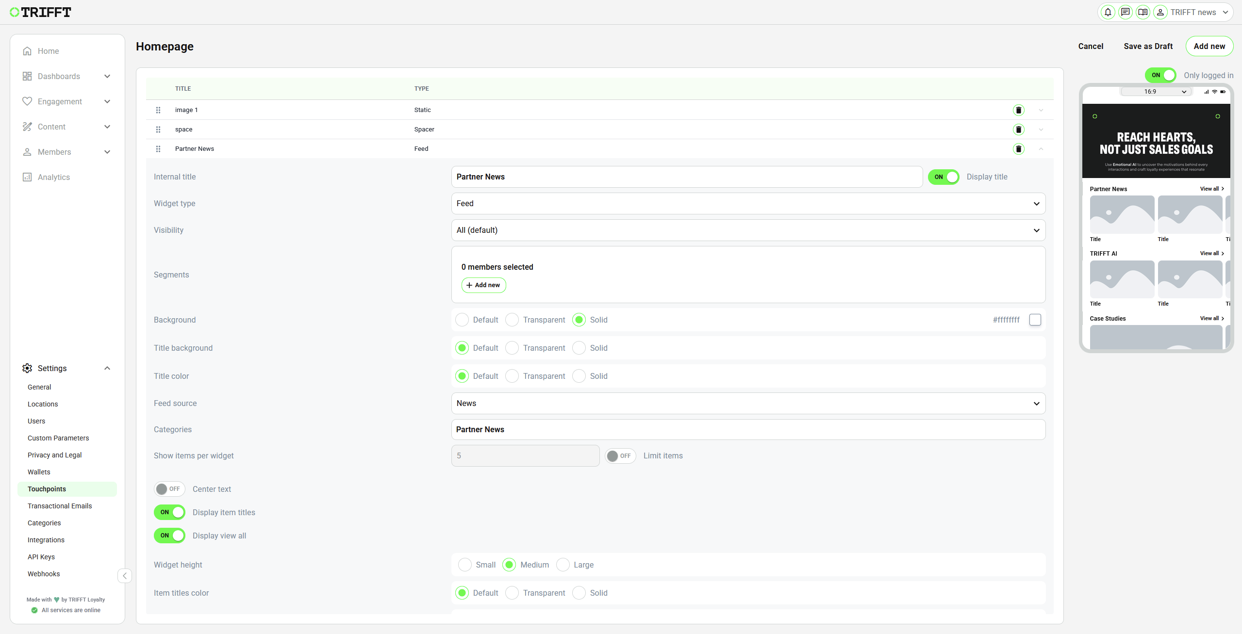
Homepage widget editor, showing Feed widget settings and the type-specific section
Visibility
| Value | Behavior |
|---|---|
| All (default) | Available to anonymous and logged-in customers, subject to segment targeting. |
| Only anonymous | Available only when the customer is not logged in. |
| Only logged in | Available only to logged-in customers. |
| None | Hidden from all customers. |
Use None to store a work-in-progress widget without displaying it in the app.
Segment Targeting
To restrict a widget by segment:
- Expand the widget.
- Under Segments, click Add new.
- Select the required segment.
- Add additional segments if required.
- Save and test with members inside and outside the selected segments.
If no segment is selected, the widget is not restricted by segment. Visibility rules still apply.
ImportantA customer must satisfy both the Visibility rule and the segment rule to see a targeted widget.
Link Configuration
Content links serve to incorporate additional links into various content types such as News Articles, Deals, and certain types of Widgets (e.g., Static Widget, Links Widget, etc.). There are three distinct types of Content Links available, depending on the content being edited. The available types may differ depending on the content that is being edited.
Content Link Type
| Option | Use |
|---|---|
| Link to detail | Opens the detail of a selected content item where the widget supports item-level content. |
| Direct link | Uses the selected app, web, or system link directly. |
Link Type
| Option | Use |
|---|---|
| App link | Utilize the app link option to direct users to specific sections within the app. Choose from various app screens via the dropdown menu to redirect members accordingly. |
| Web link | This link redirects users to external URLs. With Web Link, you can specify whether to open the link within the app or in a new browser tab. |
| System link | This type of link enables Members to share it across different channels. This Share App Feature allows for seamless sharing of content through social media, email, or messaging platforms, making it easy for users to invite friends, family, or colleagues. |
Link to an App Section
- Select Direct link.
- Select App link.
- Choose a destination from App link.
- Save and test the widget.
For example, select Coupon to open the coupon section.
Link to a Specific Content Item
- Select the supported item-level link configuration.
- Choose the app content type.
- Use the additional Item field to select the exact item.
- Save and test with a member who can access the item.
For example, a widget can open the coupon section or a specific coupon, depending on the selected configuration.
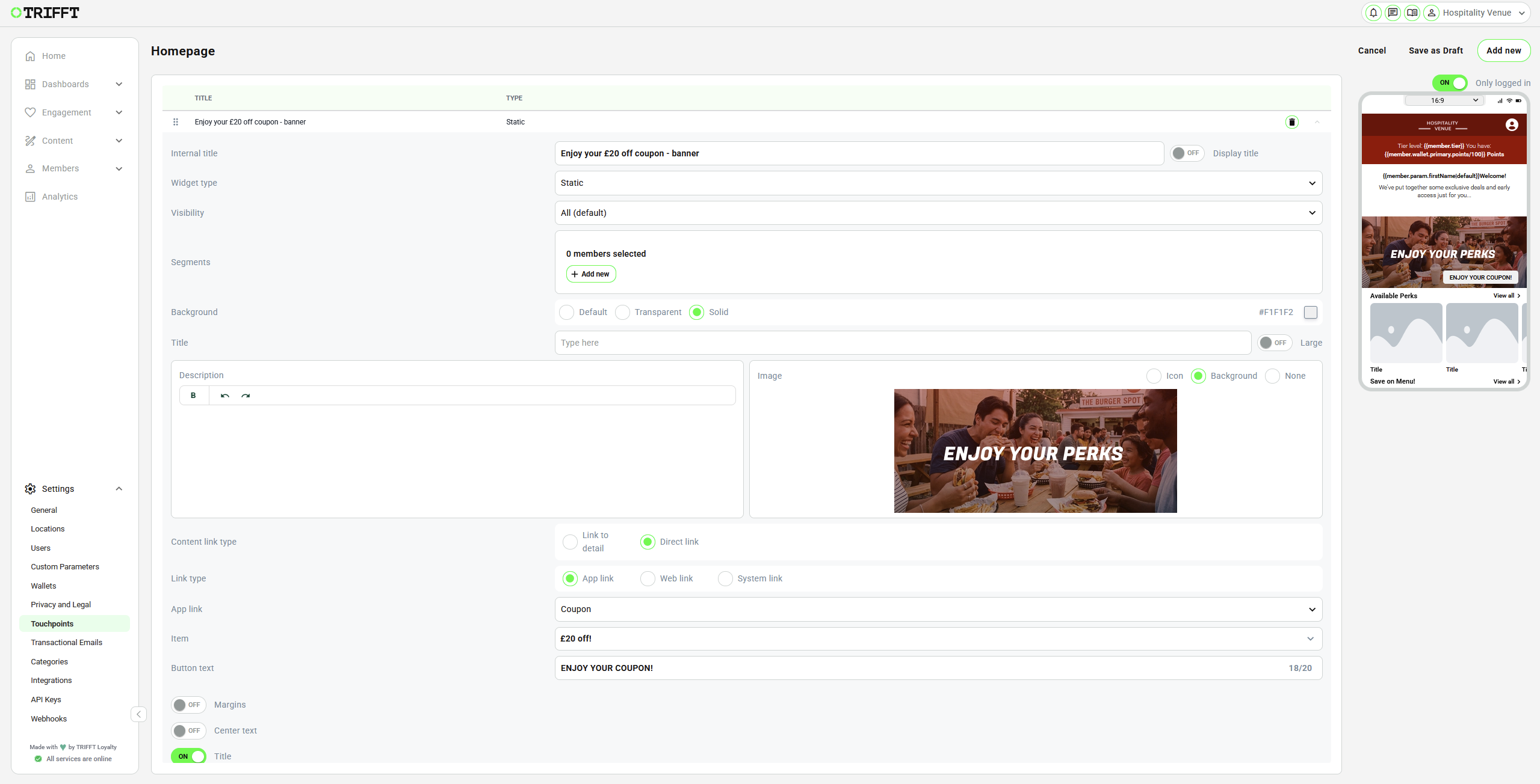
Example of the widget linked to a specific "£20 off!" coupon
Open a Website
-
Select Direct link.
-
Select Web link.
-
Select Web Link Type:
Web Link Type Behavior In-app Opens the page in the app's embedded browser. In-App (Tab) Opens the page in an in-app tab. In browser Opens the page in the device's external browser. -
Enter a complete Link url, including
https://. -
Enable Block screenshot if screenshots of the embedded page must be blocked and the selected flow supports this control.
-
Use Close Browser on specific URL if the embedded browser must close after reaching a defined callback or completion URL.
-
Save and test the complete flow.
ImportantTest website authentication, redirects, return behavior, and browser closing on a physical device. A page that works in an external browser may behave differently in an embedded browser.
Widget Reference
The following widget types are available in the Mobile App editor shown in the source configuration.
| Widget type | Purpose |
|---|---|
| Banner | Displays banner-style promotional content. Configure the media, text, appearance, and destination fields displayed by the editor. |
| Button | Displays one button linked to an app, web, or supported system destination. |
| Button Two column | Displays two button areas side by side, each with its own configuration. |
| Card | Displays the member's loyalty card summary and supported member information. |
| Contest | Displays a selected contest using the selected template and layout. |
| Contest notification | Displays a compact contest notification when the member has an unused contest token. |
| Favorite venue | Allows a registered member to view or select a favorite venue. |
| Feed | Displays a horizontal content feed or carousel. |
| Header | Displays a header with supported background, logo, greeting, and link options. |
| Displays an Instagram feed when the required integration or project configuration is available. | |
| Line | Adds a configurable divider line. |
| Link icons | Displays a group of links represented by icons. |
| Link pillboxes | Displays a group of pill-shaped links. |
| Links | Displays text links without icon or pillbox styling. |
| Points | Displays a points value from the selected wallet. |
| Profile | Displays supported member profile data and links to the profile area. |
| Side-by-side images | Displays two images next to each other. |
| Spacer | Adds empty vertical space between widgets. |
| Static | Displays configurable static content with optional image, text, button, and link. |
| Static Counter | Displays static counter-style content using its dedicated layout and spacing controls. |
| Static Text | Displays a text-only content block. |
| Static Two Column | Displays static content in left and right columns. |
| Tier | Displays details of the member's current tier. |
The types available to a specific project can depend on project configuration.
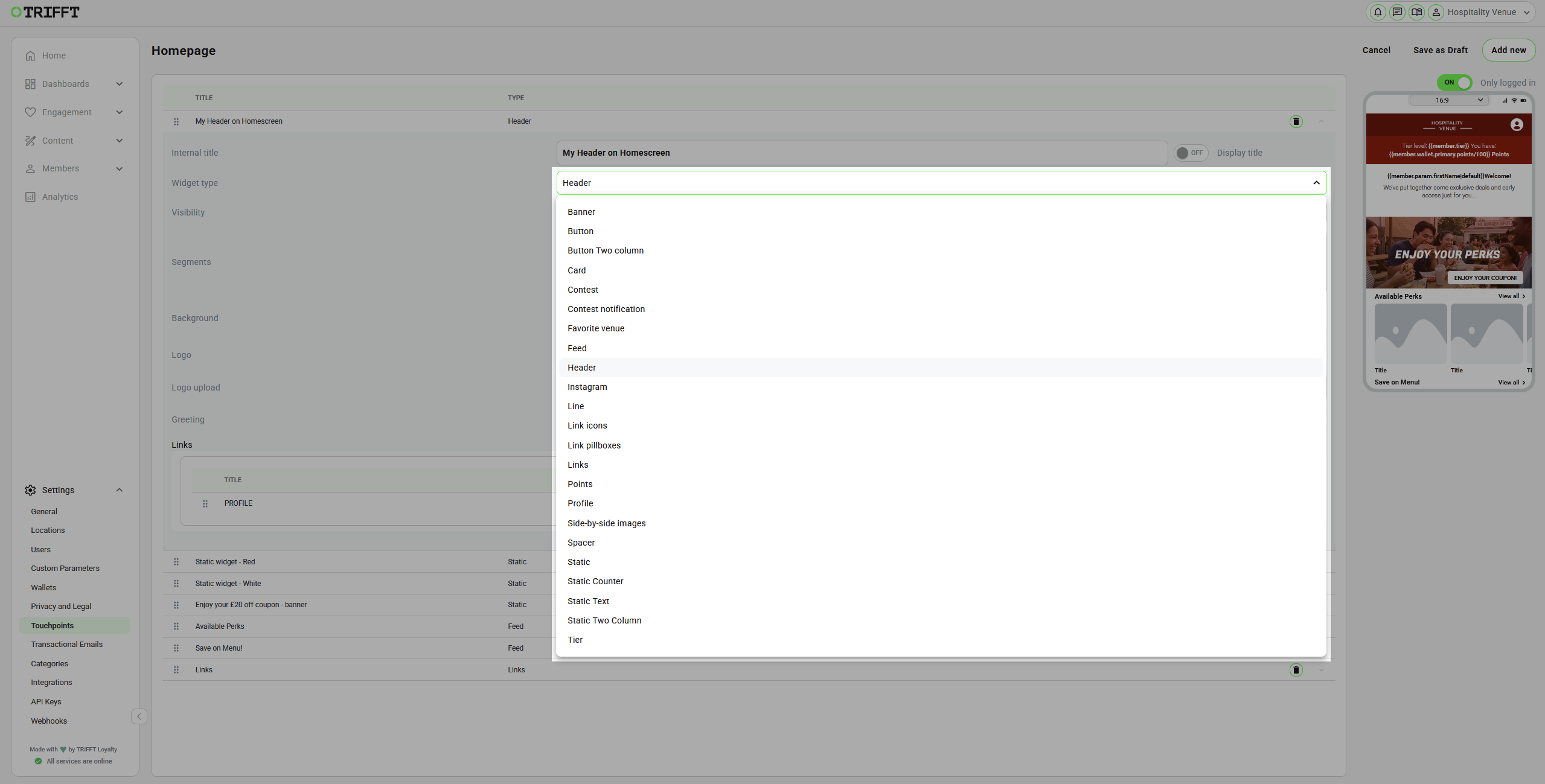
Content and Navigation Widgets
Static
Use Static for a configurable content tile or banner.
Supported controls shown in the editor include:
- title and description
- image displayed as an icon, background, or no image
- optional link and button
- margins and centered text
- square or rounded corners
- widget height
- background, title, button, and text colors
The editor provides Tiny, Small, Medium, and Large height options where available. When an image is removed, the upload area displays the recommended dimensions for the selected size. Follow the dimensions shown for the current widget size.
The demonstrated upload field accepts JPG, PNG, or MP4 files up to 5 MB and shows the recommended dimensions in the editor. Requirements can differ between widget fields, so always use the hint displayed next to the active upload control.
Button and Button Two column
Use Button for a single priority action. Configure the button text, destination, background, color, corners, and margins displayed by the editor.
Use Button Two column when two actions must appear side by side. Configure and test both destinations independently.
Feed
Use Feed to display a horizontal, swipeable collection. The feed can be mapped to supported content such as:
- coupons
- rewards
- leaflets
- products
Select the content source and configure the title, item display, link behavior, and appearance offered by the editor. Test with enough published content to verify empty, single-item, and multi-item states.
Link Icons, Link Pillboxes, and Links
These widgets present a group of destinations in different styles:
- Link icons uses uploaded or configured icons.
- Link pillboxes uses pill-shaped controls.
- Links uses text-only links.
For each item:
- Click the add control.
- Enter the customer-facing label.
- Configure an app, web, or supported system destination.
- Add the icon where required.
- Repeat for each link.
- Reorder and test all items.
Loyalty and Member Widgets
Card
The Card widget displays a member card summary. The demonstrated editor provides controls for:
- Show profile picture
- Show tier badge
- Show display name
- Show points balance
- Use tier background
- Front background and Back background
- background mode such as solid, image, or transparent
- corners and margins
Selecting the card in the app opens the supported card interaction or detail flow configured for the project.
Points
The Points widget displays the balance from a selected wallet.
- Select Points as the widget type.
- Select the required wallet under Wallets.
- Configure the title and appearance.
- Test with a member who has a known balance in the selected wallet.
Profile
The Profile widget displays supported member details such as:
- name
- registration phone number
Selecting the widget opens the profile area, including My Profile where available.
Tier
The Tier widget displays details of the member's current tier. Test it with members in different tiers and with a member who has no tier if that state is possible in the project.
Contest Widgets
Contest
The Contest widget displays a selected contest.
- Select the contest template or supported contest configuration.
- Select the exact contest.
- Configure the layout, including Steps in row where available.
- Review the progress display in the preview.
- Test with members at different contest-progress states.
Contest Notification
The Contest notification widget displays a compact notification only when the member has an unused contest token.
If the widget is configured but not visible, test with a member who has an unused token before treating the behavior as an error.
Layout Widgets
Line
Use Line to separate content areas. Configure the line's size and styling in the fields shown by the editor. The demonstrated configuration supports values ranging from a narrow divider to a much larger block, so verify the visual result in the preview.
Spacer
Use Spacer to create an intentional gap between two widgets. Prefer a spacer over empty text or transparent image workarounds.
Side-by-side images and Static Two Column
Use these types when content must be split into left and right areas:
- Side-by-side images displays two images next to each other.
- Static Two Column provides two static content columns with the type-specific controls shown in the editor.
Static Text and Static Counter
- Static Text displays a plain text block with supported font-size, color, background, title, and vertical-margin controls.
- Static Counter uses the counter-specific static layout and spacing controls shown by the editor.
Header and Footer Widgets
Global Header
Configure a shared header in SETTINGS → HEADER WIDGETS. The setting Widget for header is used on every Mobile App screen unless it is overridden.
The Header widget supports:
- solid, full-width-image, or transparent background
- logo placement or no logo
- optional greeting
- optional personalized customer information supported by the project
- an ordered list of links
- visibility and segment targeting
To display a header only on one screen, do not configure the global header. Add a Header widget to that screen instead.
Advanced Embedded-Browser Functions
Custom JavaScript
SETTINGS → EMBED BROWSER → Custom Javascript executes JavaScript in the embedded WebView context. The setting can be used for advanced requirements such as bridge listeners, DOM manipulation, or overriding global variables.
WarningCustom JavaScript is an advanced implementation feature. Incorrect code can break an embedded experience or change third-party page behavior. Use reviewed code, restrict it to the required purpose, and test every embedded flow on supported devices before publication.
Do not place API keys, access tokens, passwords, or other secrets in client-side JavaScript.
Optional Channel Settings
General Behavior
The GENERAL section also exposes optional controls. Use the description displayed below each setting as the source of truth for the current channel version.
| Setting | Confirmed purpose shown in the editor |
|---|---|
| Preview Code | Code used to preview the touchpoint in the TRIFFT News application where this workflow is available. |
| Card Pair Placeholder | Placeholder used by the card-pair functionality. |
| Disable GPS | Enables or disables GPS functionality in the Mobile App. |
| Floating Button | Selects the floating-button behavior, such as Show Card or Scan Code where available. |
| Floating Tab | Configures the floating tab. |
| Module Card Pair | Enables or disables the card-pair module. |
| Hide Points Transactions | Shows or hides points transactions. |
| Hide Registration | Shows or hides registration functionality. |
| Hide Coupon Dots | Shows or hides coupon dots. |
| Hide Coupon Validity Dates | Shows or hides coupon valid-from and valid-to dates. |
| Hide Email Login | Shows or hides the email-login option. |
| Hide data requests in user profile | Hides data-request controls related to GDPR data policy in the user profile. |
| SMS Default Country | Sets the default country used by the SMS-related flow where configured. |
Test the complete customer journey after changing any login, registration, profile, GPS, coupon, or card-pair control.
Coupon Appearance
Use SETTINGS → COUPON → Background of left side of coupon to configure the supported coupon-side background color.
Mobile Wallet Buttons
The MOBILE WALLETS section can include:
| Setting | Effect |
|---|---|
| Enable Apple Wallet | Displays the Add to Apple Wallet button on the card screen. |
| Enable Google Wallet | Displays the Add to Google Wallet button on the card screen. |
Configure and publish the corresponding wallet channels before enabling these buttons.
Profile Appearance
The PROFILE section includes:
| Setting | Purpose |
|---|---|
| Background color of profile | Applies the configured profile background color. |
| Background media of profile | Uploads profile background media. The editor accepts JPG, PNG, or MP4 up to 5 MB and recommends 720 × 1715 px. |
Screenshot Blocker
The SCREENSHOT BLOCKER section includes:
| Setting | Protected area |
|---|---|
| Block on Loyalty Card Detail | Prevents screenshots of the loyalty-card barcode or QR code on the loyalty-card detail. |
| Block on Coupon Detail | Prevents screenshots of coupon detail when a barcode or QR code is visible. |
| Block on External URL screen | Prevents screenshots on the external URL screen when the website is shown in-app. |
Test screenshot behavior on every supported platform and operating-system version used by the project.
Venue Behavior
The VENUE section includes:
| Setting | Purpose |
|---|---|
| Favorite venue feature | Allows a registered member to select a location as a favorite. |
| Disable Map | Disables the map in the supported venue flow. |
| Use Detail Image | Displays the location's detail or hero image instead of its location logo on the locations screen. |
The Favorite venue widget requires the corresponding venue functionality to be enabled and is intended for registered members.
Testing Advanced Functions
For each advanced function:
- Save the configuration as a draft.
- Verify it in the editor preview.
- Publish the relevant screen or settings through the project's publication workflow.
- Test on supported physical devices.
- Test anonymous and logged-in states.
- Test members inside and outside selected segments.
- Test empty, single-item, and multi-item content states where applicable.
- Test every internal, item-detail, web, and system destination.
- Test failure and return behavior for embedded websites.
- Confirm that member-specific widgets use the correct wallet, contest, tier, profile, and venue data.
Updated 20 days ago