
Mobile App Set Up
This Technical Setup Guide provides the configuration steps required to initialize and manage the Mobile App channel within the TRIFFT Content Cockpit.
This guide explains how to create a Mobile App channel and configure the baseline customer experience: translations, branding, languages, bottom navigation, shared header, first-run screens, Homepage, and Profile.
Advanced widgets and optional channel settings are covered in Mobile App Other Functions.
Before You Start
Prepare the following:
-
access to the TRIFFT Content Cockpit with permission to manage Touchpoints
-
approved brand colors and image assets
-
the default app language and the complete list of supported languages
-
translations for each supported language
-
the planned bottom-navigation destinations and their order
-
the URL for an embedded menu link, if used
-
the content that will appear on the Homepage and Profile
-
any member segments used to target widgets
-
a default map position if the app uses locations
-
test members representing anonymous, logged-in, and targeted-segment scenarios
-
physical iOS and Android devices required by the project
Before building the screens, decide the customer journey:
- What should a customer see after a fresh installation?
- Does the customer need to choose a language before login or registration?
- What should appear after the first login or registration?
- Which destinations belong in the bottom navigation?
- Which Homepage content is public, member-only, or segment-specific?
1. Create the Mobile App Channel
-
Log in to the TRIFFT Content Cockpit.
-
Navigate to Settings → Touchpoints.
-
Click Add new.
-
Configure the channel:
Field Configuration Name Enter an internal name that clearly identifies the app or project. Type Select Mobile App. Description Enter an optional internal description. -
Click Save.
-
Open the new channel.
The channel contains the SCREENS, TRANSLATION, and SETTINGS tabs.
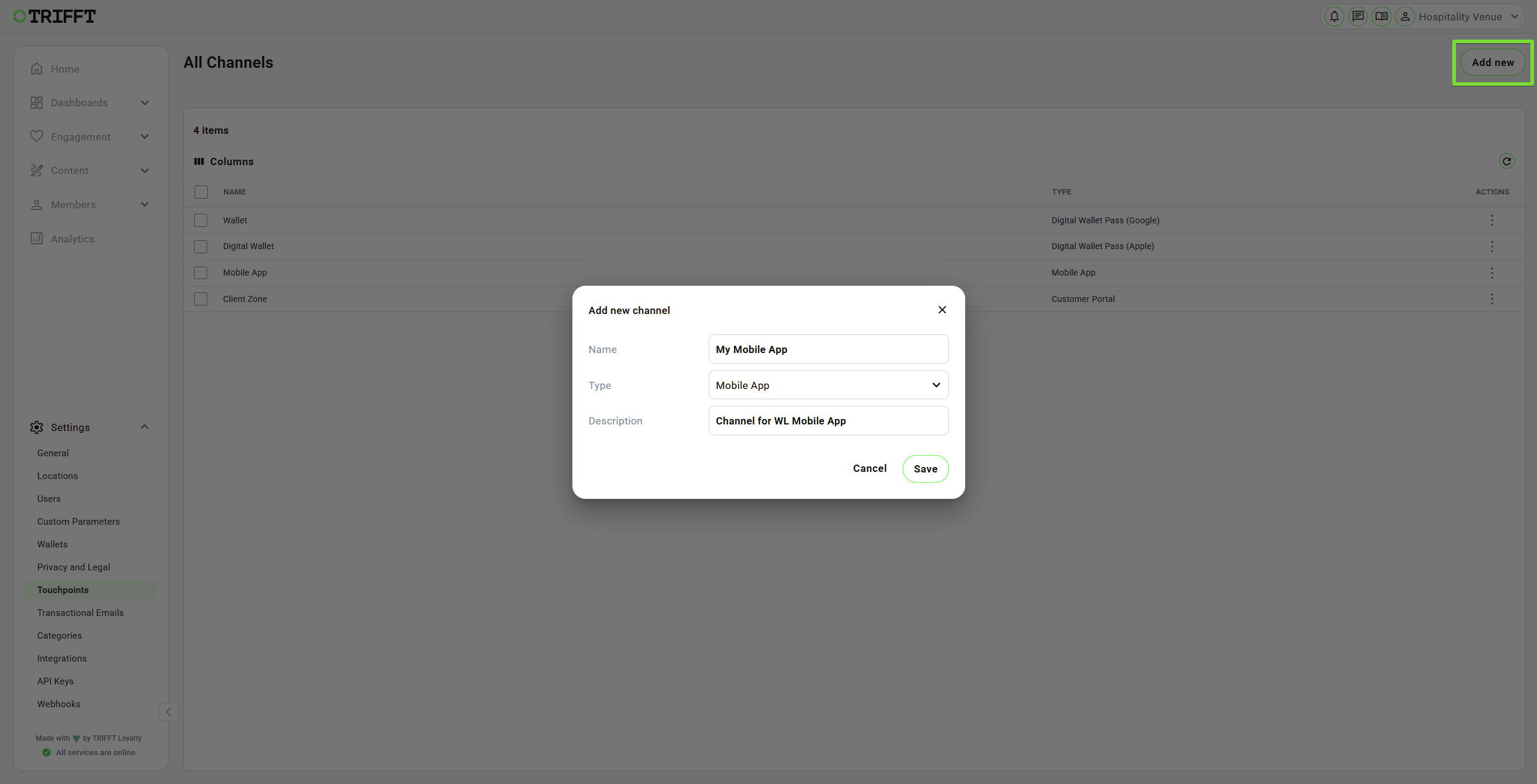
Create a new channel - Mobile App
2. Configure Translations
- Open the TRANSLATION tab.
- Select the required language from the language list.
- Use the search field to find a translation by its label or key.
- Complete or review all customer-facing values.
- Click Save.
- Repeat the process for every language that will be enabled under Available Languages.
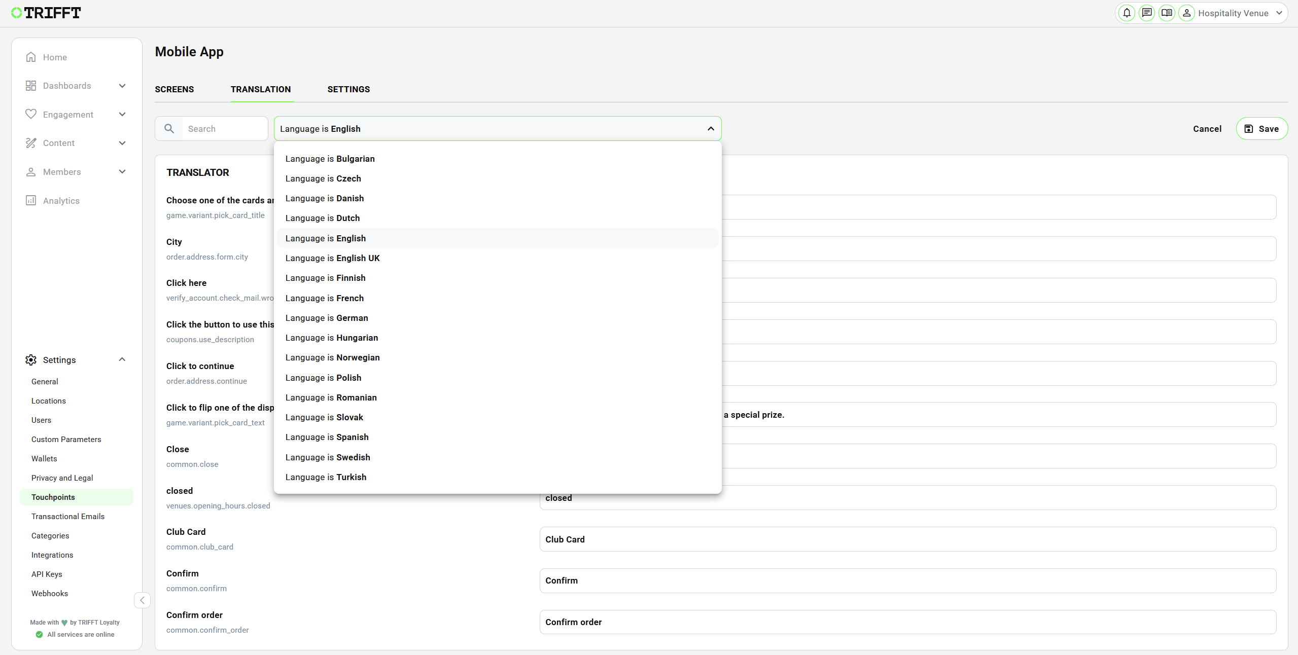
Choose desired language and set your own Translations
Preserve Dynamic Placeholders
Some translations contain dynamic placeholders for values such as:
- timestamps
- amounts and currencies
- counts
- dates and time units
Translate the surrounding text, but preserve the placeholder exactly as shown in the editor. Changing a placeholder can prevent the app from inserting the dynamic value correctly.
Configure the Embedded Menu URL
The embed:menu_link navigation route uses a URL stored in translations.
- Search for
commonor Menu Link. - Locate Menu Link (
common.menu_link). - Enter the complete destination URL, including
https://. - Save the translation.
- Repeat this check for every enabled language.
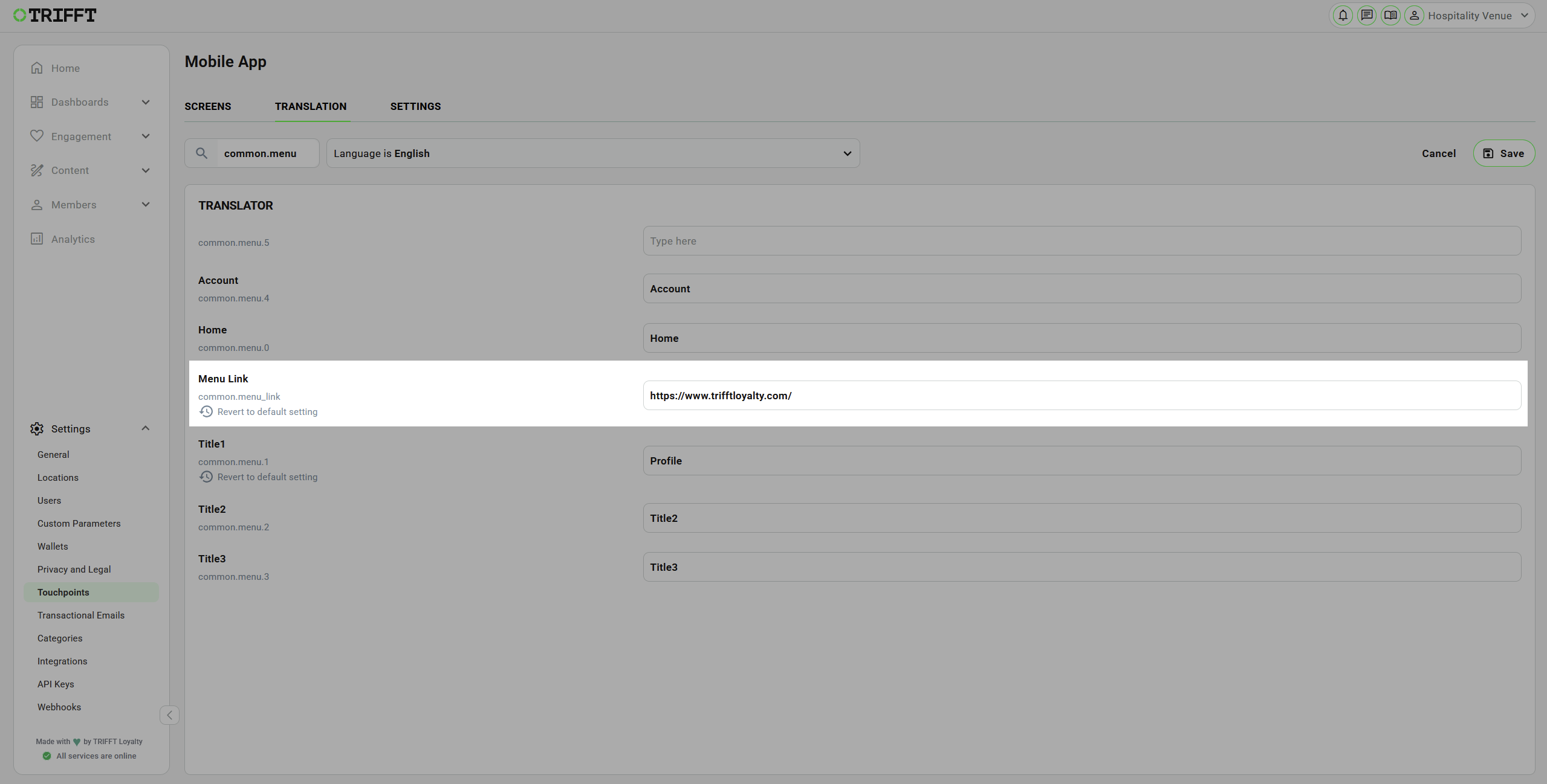
Example of setting the URL for the bottom navigation button
NoteAlthough this value is located in the TRANSLATION tab, it is a destination URL used by the
embed:menu_linkroute.
3. Apply App Colors
Use SETTINGS → COLORS to define channel-wide colors. The available fields cover the main screen background and specific elements such as error messages, bottom-navigation icons, Homepage tiles, login controls, and card-pair components.
- Enable the color setting that you want to override.
- Enter or select the approved color.
- Review the effect in the relevant screen preview.
- Repeat for the required elements.
- Click Save after completing the channel settings.
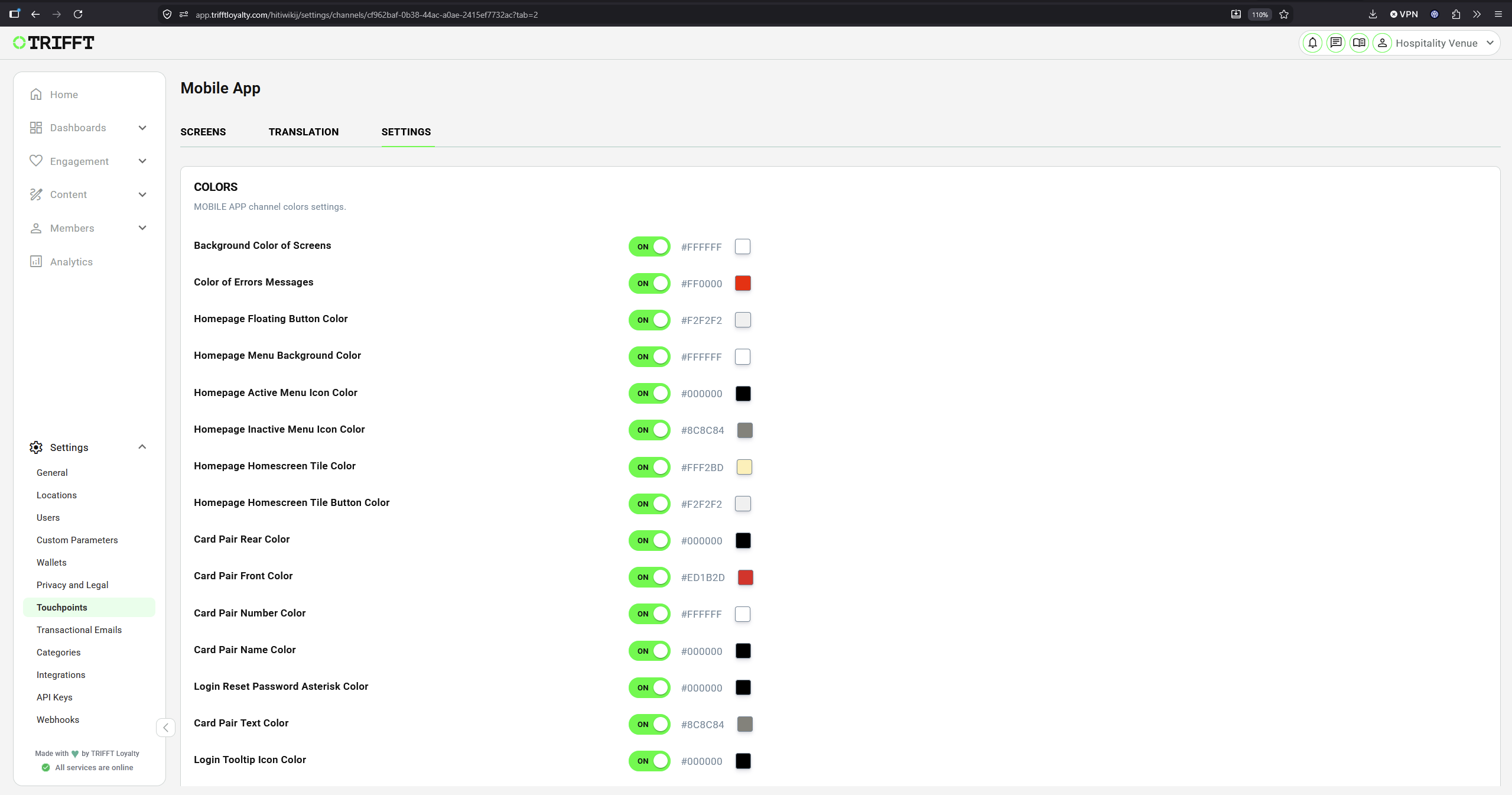
Setting the basic color theme for your App
Use sufficient contrast between backgrounds, text, icons, and buttons. Verify the design on physical devices because the final result can vary with screen size and content length.
4. Configure Languages and Default Map Position
In SETTINGS → GENERAL, configure the following baseline settings:
| Setting | Purpose |
|---|---|
| Mapbox Position | Default map coordinates used when the app contains a map and the customer's current position is unavailable or GPS permission has not been granted. |
| Initial Language | Default language used by the app. |
| Available Languages | Languages that customers can use in the app. |
Mapbox Position
Enter the default coordinates in the format expected by the editor. Use a position that provides a useful initial map view for the project.
ImportantMapbox Position is a fallback position. It does not grant device location permission and does not replace location data configured elsewhere in TRIFFT.
Initial and Available Languages
- Enable Initial Language and select the default language.
- Enable Available Languages and add every supported language.
- Confirm that each available language has a completed translation set in the TRANSLATION tab.
- Save the settings.
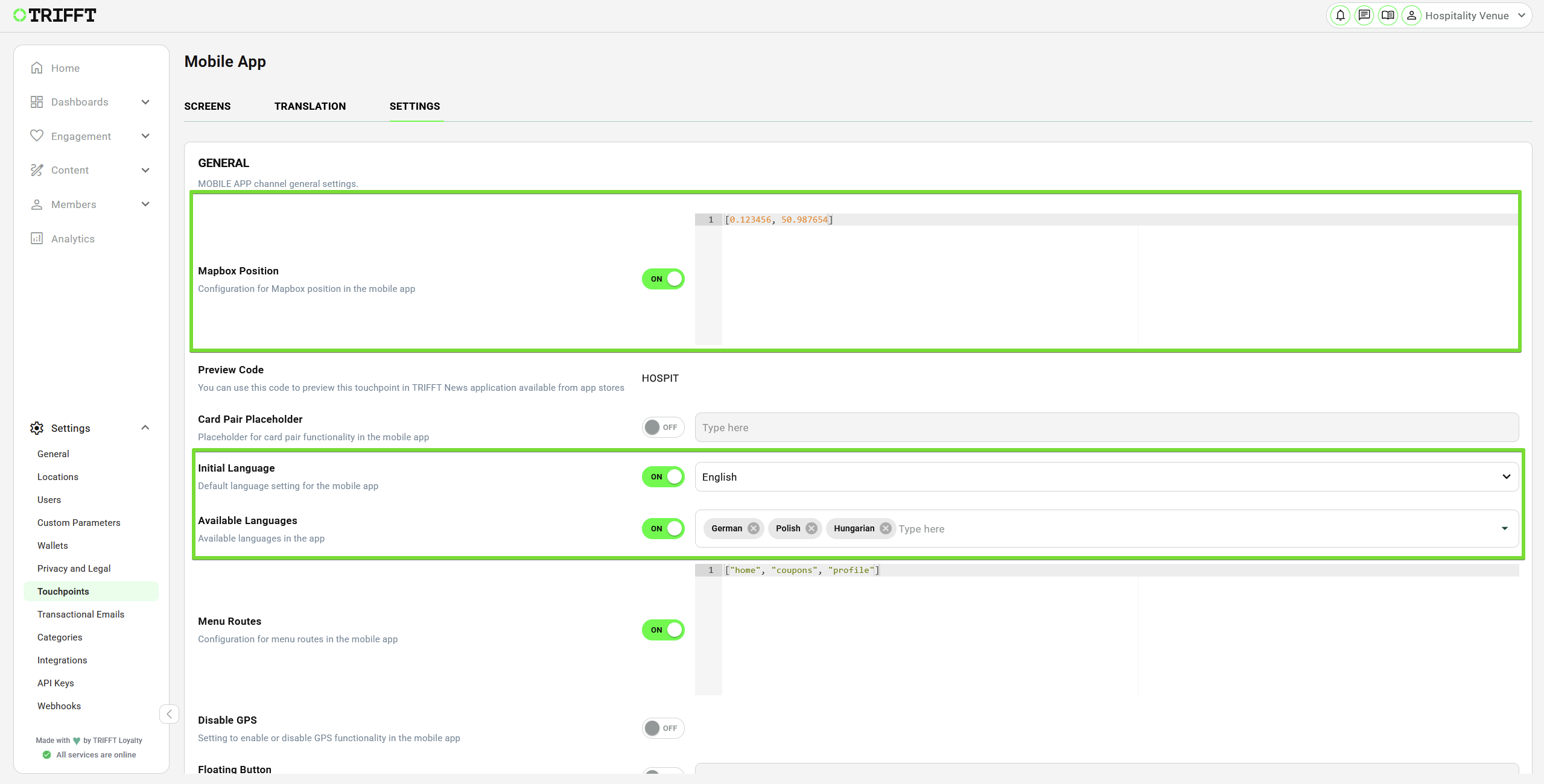
Mapbox and Languages basic settings
5. Configure the Bottom Navigation
The Menu Routes setting controls the destinations and order of the bottom navigation.
- In SETTINGS → GENERAL, enable Menu Routes.
- Enter an ordered array of supported route values.
- Save the settings.
- Verify every navigation item in the app preview and on a test device.
Example:

| Route in the example | Destination |
|---|---|
home | Homepage |
embed:menu_link | URL stored in Menu Link (common.menu_link) in the TRANSLATION tab |
coupons | Coupon section |
leaflets | Leaflet section |
profile | Profile section |
The array order determines the navigation order.
WarningUse only routes supported by the project and keep the array syntax valid. Test every item after changing the navigation.
6. Configure a Shared Header
A shared header is optional. When configured under SETTINGS → HEADER WIDGETS, it is displayed on Mobile App screens unless a screen overrides it.
-
Locate HEADER WIDGETS.
-
Select Header in Widget for header.
-
Configure the common controls:
Setting Purpose Internal title Administrative name used in the editor. Display title Controls whether the internal/display title is shown to the customer. Visibility Restricts the header by login state or hides it. Segments Restricts the header to selected member segments. -
Choose a Background option:
- Solid
- Full width image
- Transparent
-
Configure the logo position or select No logo.
-
Configure a greeting if required. A greeting can include personalized member information supported by the project's template configuration.
-
Add header links if required.
-
Review the preview and save the settings.
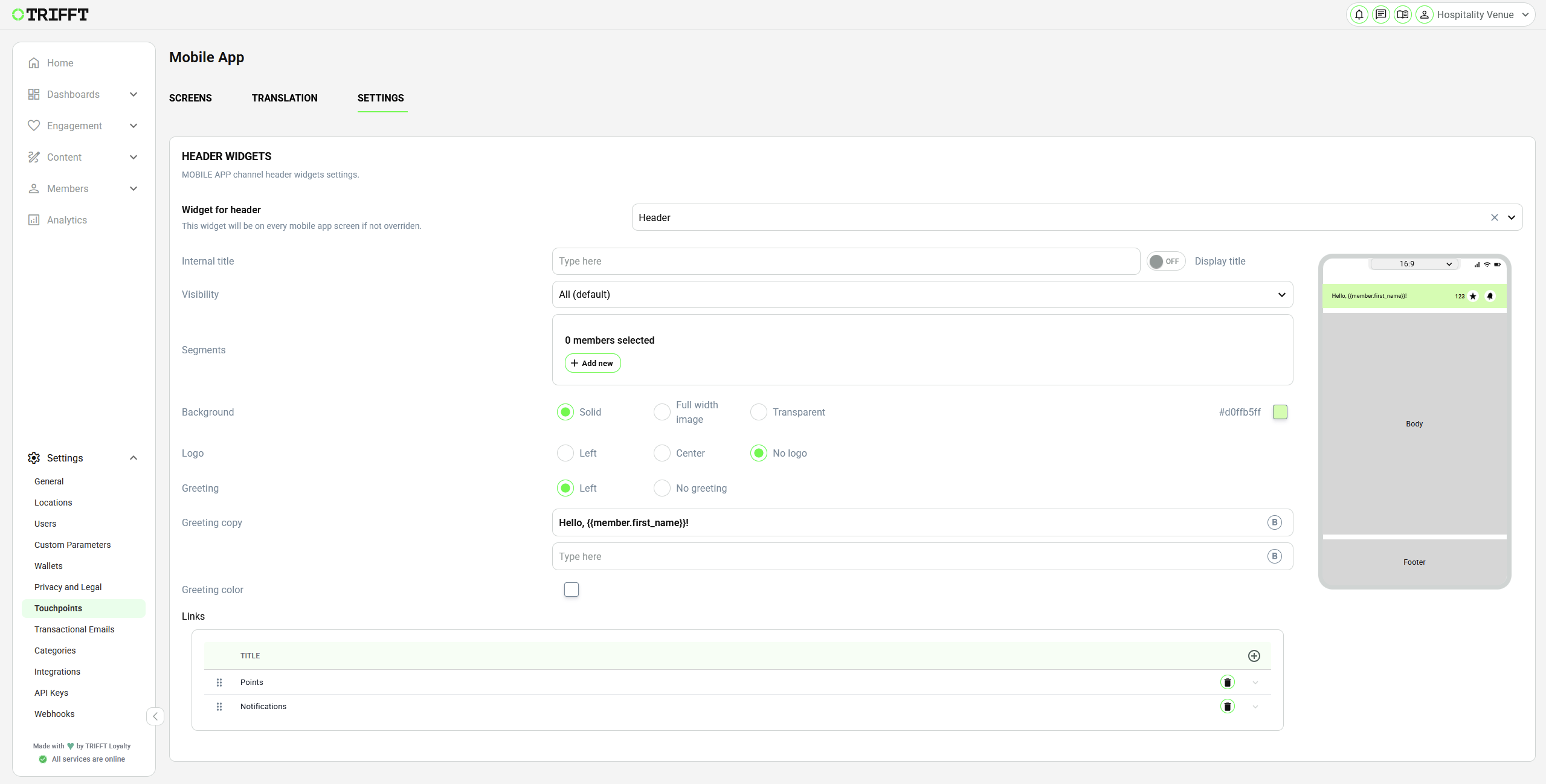
Example of Header Settings
To display a header on only one screen, leave the global header empty and add a Header widget to that screen instead.
7. Configure App Welcome
App Welcome is the first-run journey. It is displayed once when the customer opens the app after a fresh installation.
-
Open SCREENS.
-
Select App Welcome.
-
Click Add new.
-
Select a screen type:
Screen type Use Welcome screen Introduces the application. Language screen Allows the customer to choose the app language. Info screen Displays informational text and optional media. -
Configure the fields displayed for the selected type. These can include:
- Internal title
- Action
- customer-facing Title and Description
- image or video
- button labels
- visibility toggles for title, description, navigation, or skip controls
- background, text, navigation, border, and button colors
-
Add additional screens if the journey requires more than one step.
-
Drag the items into the required order.
-
Review each step in the preview.
-
Click Save as Draft.
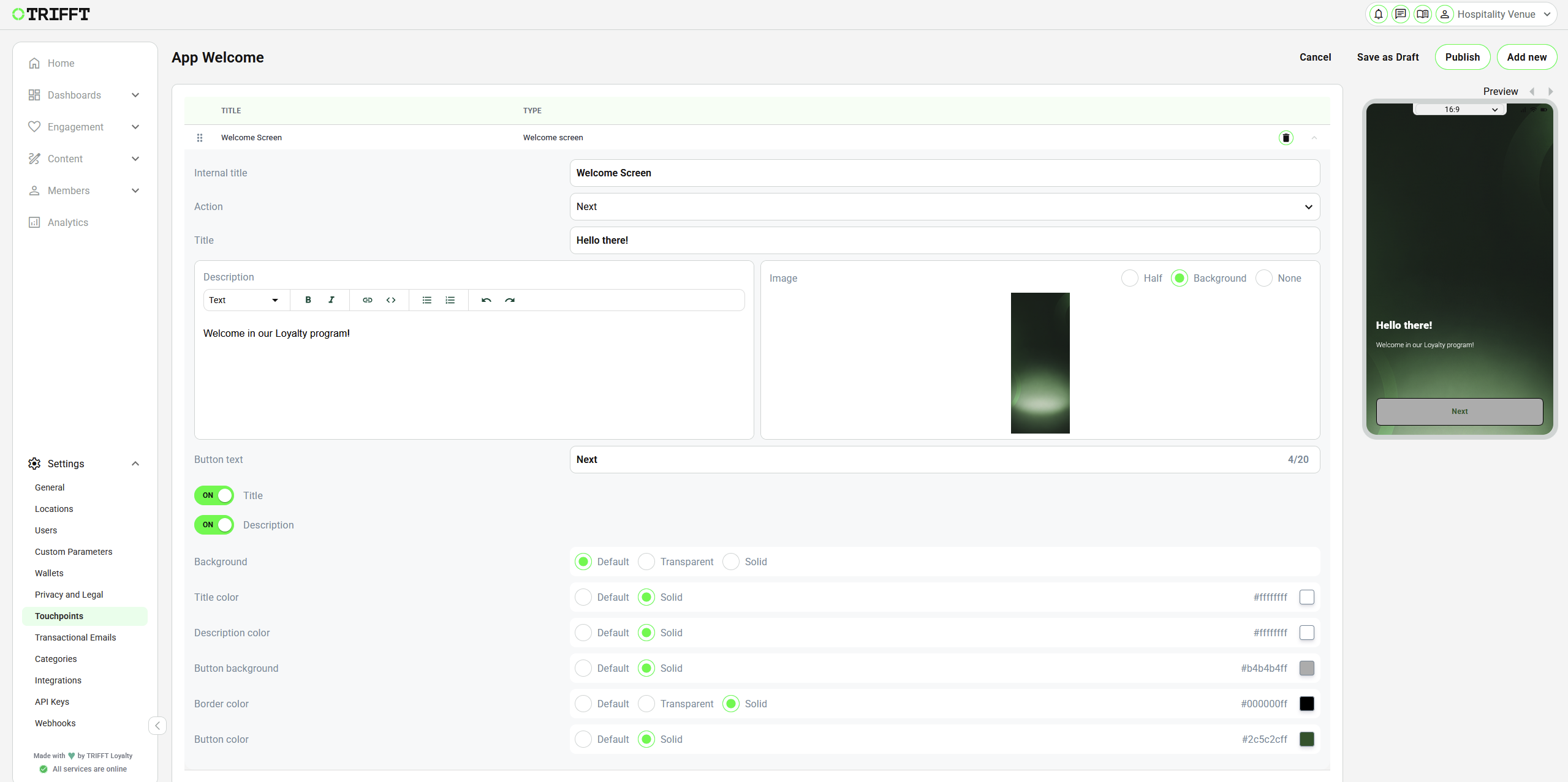
NoteApp Welcome is intended to appear once after a fresh installation. It is not the post-registration onboarding journey.
8. Configure Onboarding
Onboarding is displayed after the customer's first login or registration.
-
Open SCREENS.
-
Select Onboarding.
-
Click Add new.
-
Select a screen type:
Screen type Use Welcome screen Introduces the loyalty experience after authentication. Info screen Displays informational text and optional media. Card screen Supports pairing an existing loyalty card or generating a new card according to the project flow. Preference center screen Users can choose their interests or preferences. It usually shows a list of Public Segments (for example: “Running”, “Vegan options”, “Food news”). Users can select the ones they like, and those selections become their preferences. -
Configure the content, controls, media, and colors shown for the selected type.
-
Add and reorder additional screens as required.
-
Review the complete sequence in the preview.
-
Click Save as Draft.
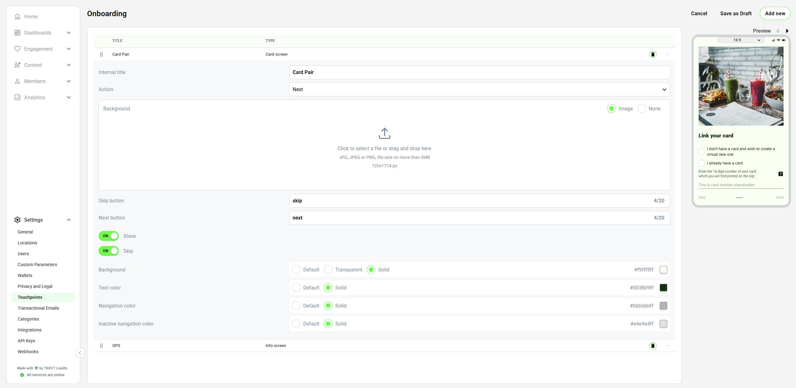
Example of the Onboarding process with 2 screens, showing the details of the Card pair screen
ImportantApp Welcome and Onboarding are triggered at different stages. Test both with a fresh installation and a test member that has not completed the first login or registration journey.
9. Build the Homepage
-
Open SCREENS → Homepage.
-
Click Add new. A new widget is added to the end of the list and initially uses the Static type.
-
Enter an Internal title.
-
Enable Display title only if the title should be visible to customers.
-
Select the required Widget type.
-
Configure Visibility:
Value Who sees the widget All (default) Anonymous and logged-in customers, subject to segment targeting. Only anonymous Customers who are not logged in. Only logged in Logged-in customers. None Nobody. Use this to prepare a widget without displaying it. -
Under Segments, click Add new if the widget should be limited to selected member segments. Leave the list empty if no segment restriction is required.
-
Configure the type-specific content and appearance.
-
Review the mobile preview.
-
Repeat the process for all Homepage widgets.
-
Drag widgets into the required order.
-
Click Save as Draft.
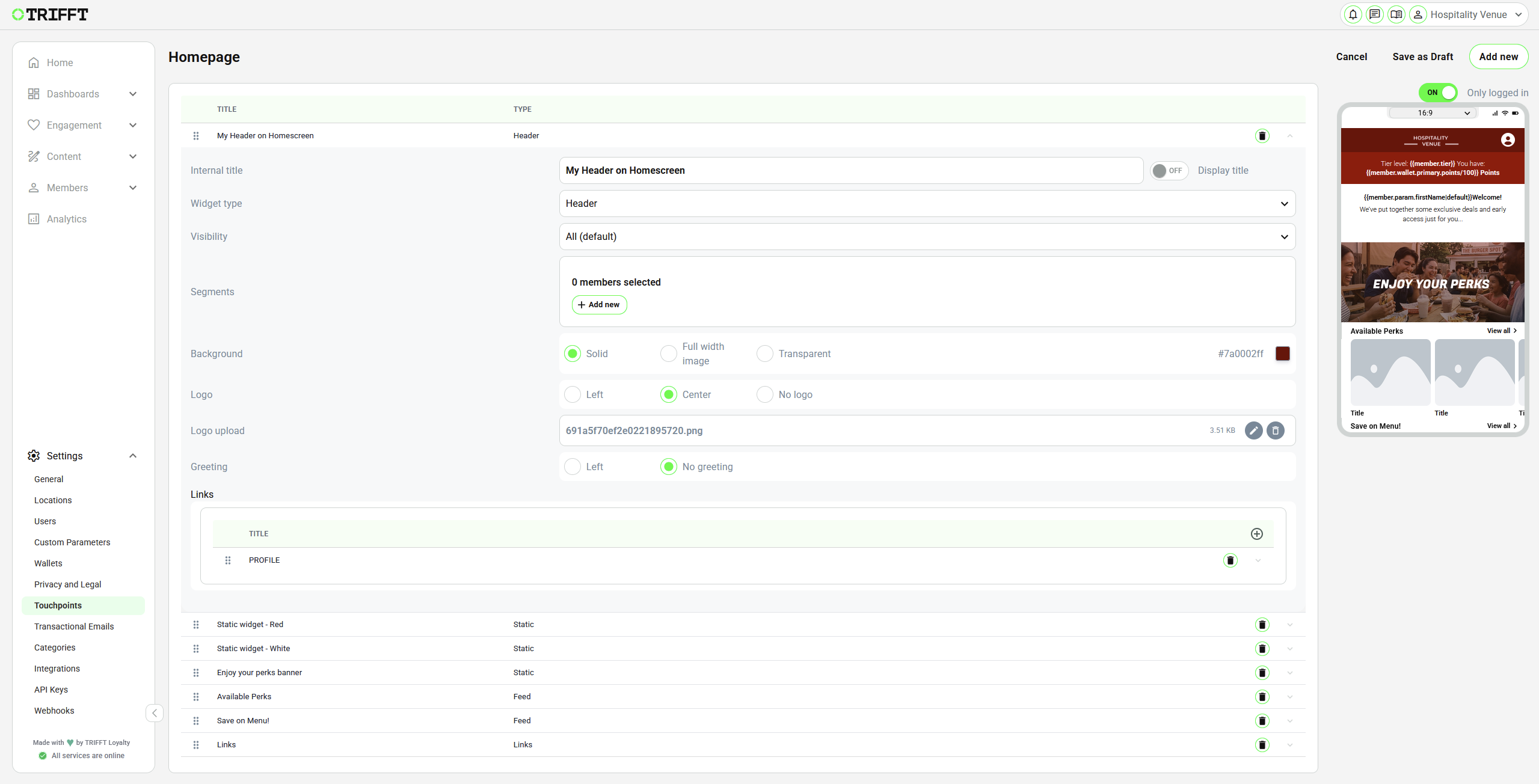
Example of Homepage builder with a few widgets, showing the detail of Header widget settings
Recommended Baseline Homepage
A practical baseline can include:
- a shared or screen-specific Header
- a Card, Points, or Tier widget for the member's loyalty status
- one or more Feed widgets for relevant content
- Static or Button widgets for priority actions
- Spacer or Line widgets where visual separation is needed
Use Mobile App Other Functions to select and configure the appropriate widget types.
10. Build the Profile Screen
The Profile screen uses the same widget workflow as the Homepage.
- Open SCREENS → Profile.
- Add the required widgets.
- Configure visibility and segment targeting.
- Reorder the widgets.
- Review the preview.
- Click Save as Draft.
A Profile widget can display the member's name, email, registration phone number, and other supported profile information. Selecting the widget takes the customer to the profile area.
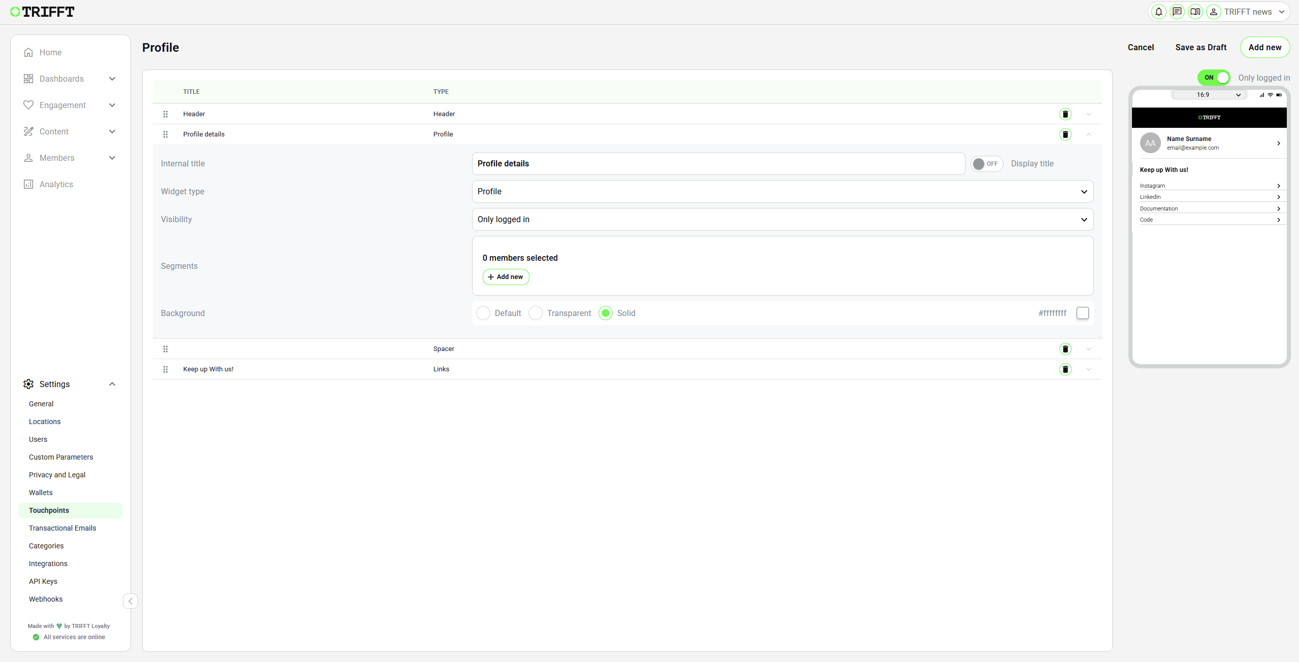
Example of Profile screen builder with the Profile widget
11. Review and Publish
Complete the following process for every configurable screen:
- Click Save as Draft.
- Review the draft and its preview.
- Publish the screen through the available screen publication action.
- Return to the SCREENS list.
- Confirm that the screen shows PUBLISHED rather than DRAFT.
ImportantA saved draft is not the active published configuration. Confirm the status of every changed screen before launch.
12. Test the Baseline Experience
Test on physical devices and with realistic data.
- Test the app after a fresh installation.
- Verify the complete App Welcome sequence.
- Verify the default language and switch to every available language.
- Test login and registration.
- Verify the complete Onboarding sequence after the first login or registration.
- Test the bottom navigation in the configured order.
- Verify the embedded menu URL if
embed:menu_linkis used. - Test the Homepage and Profile as:
- an anonymous customer
- a logged-in member
- a member inside each targeted segment
- a member outside the targeted segments
- Test every button, internal link, item-detail link, and website link.
- Verify the fallback map position with device location permission denied, if maps are used.
- Confirm that every changed screen is published.
Launch Checklist
-
The Mobile App channel exists and uses a clear internal name.
-
Your brand colors are set.
-
The initial language is correct.
-
Every available language has complete saved translations.
-
Dynamic translation placeholders remain unchanged.
-
Menu routes use supported values and appear in the correct order.
-
The embedded menu URL is configured for every relevant language.
-
App Welcome works after a fresh installation.
-
Onboarding works after the first login or registration.
-
Homepage and Profile widgets are ordered correctly.
-
Widget visibility and segment targeting have been tested.
-
All destinations and external URLs work.
-
The fallback map position is correct where required.
-
Every required screen shows PUBLISHED.
-
The final experience has been tested on supported physical devices.
Next Step
Continue with Mobile App Other Functions for the complete widget catalog, link behavior, global footer, Custom JavaScript, Mobile Wallet controls, and other optional settings.
Updated 20 days ago